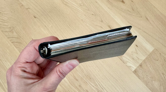
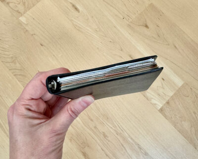
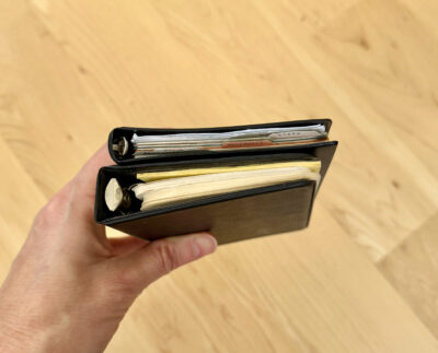
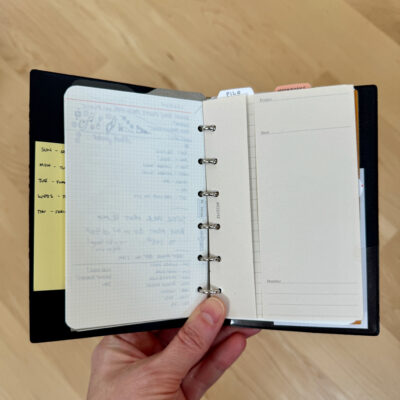
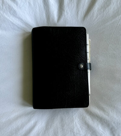
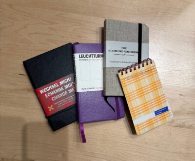
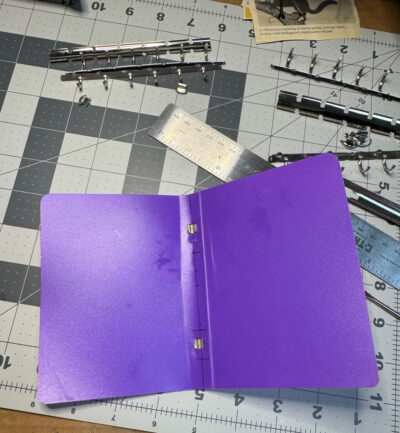
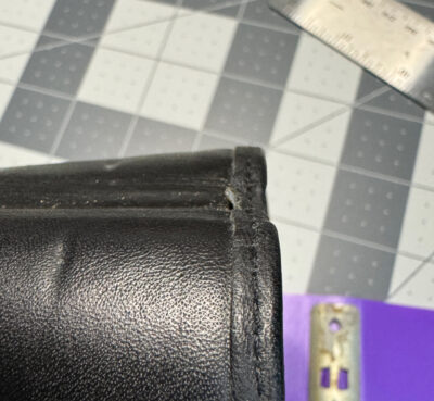
I’ve recently swapped this little cutie into my daily carry bundle: a sort of basic plastic looseleaf made by Brunnen. I saw it on someone’s Instagram and was intrigued: I have a couple of other Brunnen notebooks in my collection from past trips to Europe, but it’s not a brand you ever see for sale in stores in the US. But though I’m calling this Brunnen looseleaf notebook”sort of basic,” it actually has some interesting qualities that distinguish it from the competition.
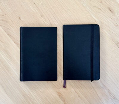
The exterior is very plain black plastic, with almost squared corners. The plastic has a slight texture meant to resemble leather but it’s very obviously plastic! At the edge of the spine there is a striated texture, I guess to help it bend more easily. The Brunnen name and product number 65010 are very subtly stamped there.
One thing that’s nice about the exterior is something it lacks: rivets on the spine, which are common on this type of inexpensive looseleaf notebook. It’s not that big a deal, but I think the plain spine is more attractive somehow.
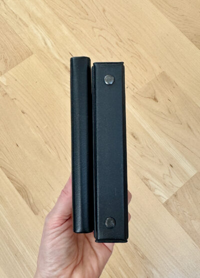
Brunnen looseleaf vs. 1990s generic pocket looseleaf from my collectionBrunnen pocket looseleaf spine vs. generic looseleaf with rivets holding rings
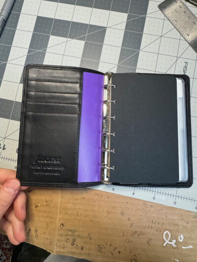
When you open the notebook, it is equally plain inside– no markings anywhere, and just one little clear plastic pocket on the back where you could tuck a couple of business cards or receipts.
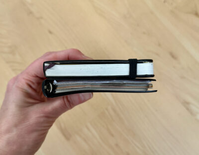
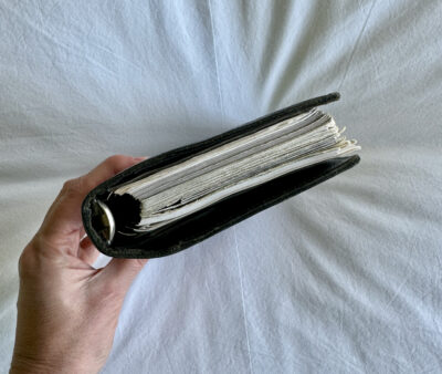
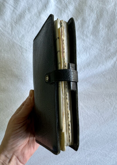
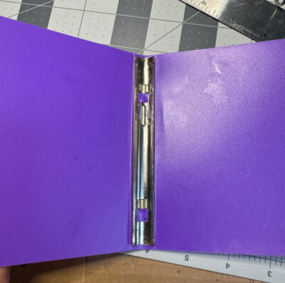
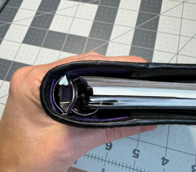
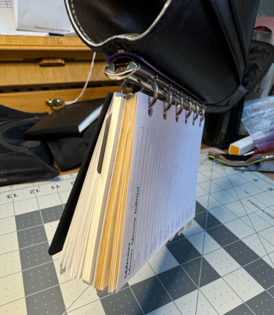
You’ll notice that the Brunnen looseleaf notebook has very small rings– another factor that differentiates it from the average pocket looseleaf, which tends to have 1/2″ rings. The small 11mm rings always seem to attach vs. small tabs at the end of a backplate– at least they do in all the Filofax, Plotter, and Raymay DaVinci notebooks I’ve seen. 1/2″ rings attach either by a hidden set of clips, or in cheaper notebooks, by those rivets on the spine.
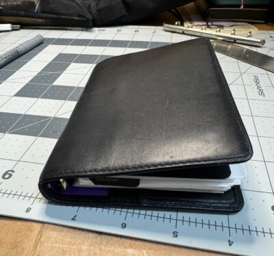
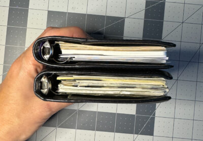
The small rings make this a pleasantly slim and pocketable notebook. It’s about the thickness of a pocket size Moleskine hardcover notebook. The width is also about the same, though it’s slightly shorter: it’s about 94mm x 137mm. It’s definitely smaller than any other generic plastic looseleaf notebook I’ve seen.
Brunnen looseleaf vs MoleskineBrunnen looseleaf vs. MoleskineBrunnen looseleaf vs Filofax Guildford Pocket Extra SlimBrunnen looseleaf vs Filofax Guildford Pocket Extra Slim
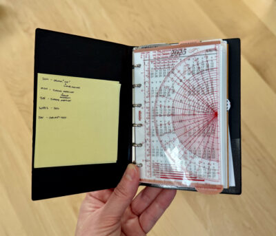
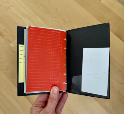
As you can see, I have Plotter inserts filling this notebook, and they work very nicely, especially if you add some dividers that are tabbed on the top. I also added some stickynotes to make tabs on the top of a couple of the Plotter project folders.
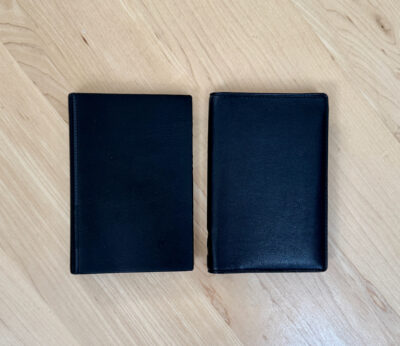
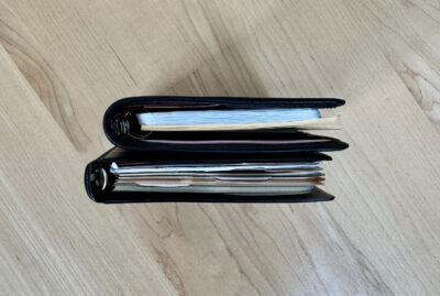
I previously had the same contents in my Filofax Guildford Pocket Extra Slim, which is a great size, but thicker, and almost impossible to buy these days. Plotter’s Mini size notebooks are wider and bulkier due to the metal spine plate and the thickness of the leather. They’re also a lot more expensive. If you want a really basic, really slim pocket size looseleaf, this Brunnen notebook is a great choice. I paid about $21 for it on Amazon— that’s more than a truly basic generic pocket looseleaf, but a lot less than you’ll pay for a leather organizer from Filofax or Plotter. Sometimes it’s comforting to use a cheap, easy to replace notebook, especially one that is so light and small and portable! I’ve left the Guildford behind when I was traveling a few times because I was afraid I’d lose it. I’d still be horrified if this Brunnen looseleaf notebook was lost or stolen, but at least I wouldn’t feel like I could never buy another one.
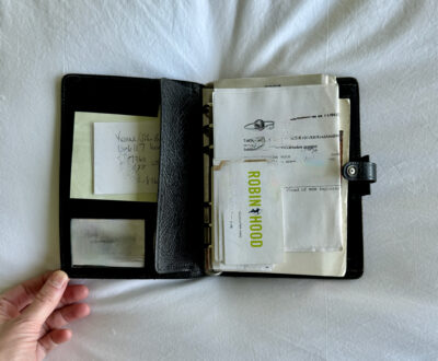
I was recently helping a friend with some decluttering, and you can imagine my joy when we unearthed this:
This was her Filofax from around 1988 or so, which she used for many years until switching to a Palm Pilot. (The Palm Pilot didn’t last long– after letting the battery die and losing all her data, she went back to using a pocket size Filofax as her address book while gradually transitioning to mostly using her computer and phone for organizing her calendar and contacts.)
When I think of the original, prototypical Filofax that became all the rage in the ’80s, it’s exactly this model. It’s gorgeous, made of beautiful sturdy calf leather. It’s been broken in quite a lot but is still in good condition other than some scuffs here and there. It has also lost the little cover backing from the snap– a very common problem with Filofaxes of this era.
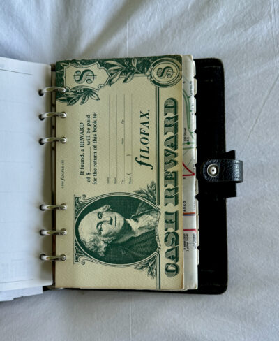
This model was called the Winchester, but until later in the 1990s, Filofax didn’t stamp the model names inside the organizers. In the ’80s, they stamped a code number that indicated the number of pockets, the leather type, and the ring size: 4CLF7/8. This model has 4 pockets: an ID pocket and a small pocket above it, and then 2 full length pockets, a flat one in the front and a gusseted one in the back. The CL stands for the calf leather, and the rings are 7/8″ in diameter.
The size of this Winchester Filofax seemed almost smaller than I remembered them being. That may be because the corners have been rounded and bent by it being stuffed fat with inserts and banged around in a handbag for many years, but it’s also because it actually is smaller than some of today’s Filofax models. (You can see a comparison of an identical Winchester vs. the popular Malden model dating from the 2010s to present at this link. The Malden looks much bigger.) This Winchester Filofax measures 7 3/16 x 5″, a hair smaller than the 7 1/4″/ 185mm that was specified in Filofax catalogs. I’m usually so loyal to pocket size notebooks, but fondling this Filofax is making me want one just like it!
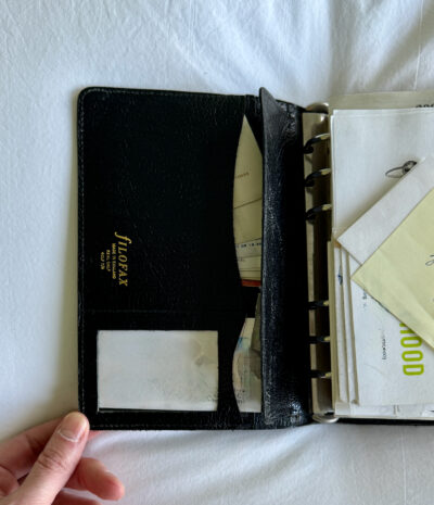
There’s no Filofax logo anywhere on the outside of the organizer, perhaps because this kind of leather wouldn’t lend itself to blind stamping? It’s a thick, relatively stiff leather with a nice grain and glossy surface. It would definitely have taken some breaking in, and would probably never lie flat even if it hadn’t been sitting closed for 20+ years. There are ring protector flaps that also serve to keep items very secure in the pockets– almost too secure, as it can be a bit awkward to get under the flaps due to the leather stiffness.
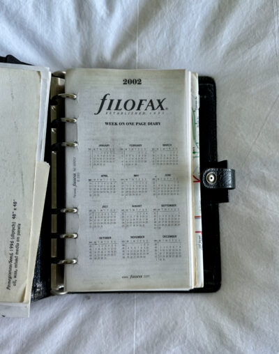
My friend used this mostly as an address book. The 2002 calendar inside it is totally blank, though she said she probably wrote some appointments in previous years’ calendars. She stuffed various business cards into the pockets and had loose papers tucked in front of the pages. The back pocket contents were a real time capsule: a car service voucher from a job she retired from 10 years ago, and a long-distance calling card, from pre-cellphone, pre-Skype/Zoom/Facetime days!
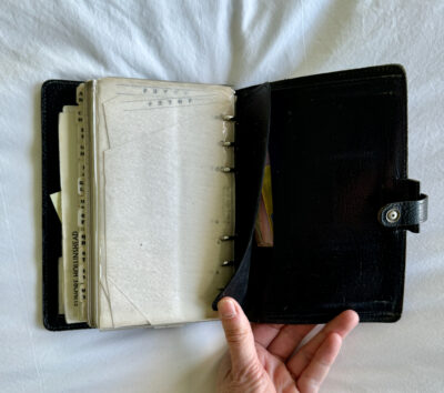
The inserts still include a lot of what was probably part of the package when she bought it: alphabetical tabs and address pages, which she used, and some “don’t forget” pages, which she didn’t. The original “reward if lost” card is in there too, though she didn’t fill it in. There is also a top-opening plastic envelope, which she didn’t seem to use.
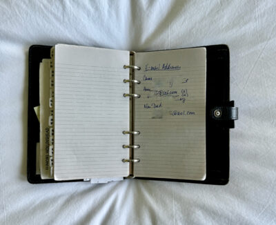
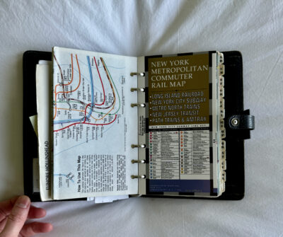
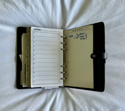
She had plain and lined grey paper with various lists and notes, including some jottings about a trip to Egypt. I thought it was cute that she had a single notes page titled “Email Addresses,” containing the few people she knew who had one back at the dawn of the internet! (There was no space for email information in the address page format.) She added some maps, and some thin onion skin paper “Notes” pages with 1-4 numbering on them. I don’t recall seeing that layout before. The reference number is 807, which I haven’t been able to find in the Filofax catalogues of that period. The closest I could find was a “Memo, 3 divisions” insert, numbered 806. Given that Filofax catalogued a mind-boggling array of inserts for every possible purpose, it’s funny that they missed this one! But also rather understandable that they would have been hard to keep track of… (See my guest post at Philofaxy for a similar situation!)
All my friend’s inserts except the calendar have a soft raggedy-ness to the edges, showing that they spent a long time in that organizer, being carried around and flipped through over the years. But a lot of the pages are blank: my friend is not really much of a notebooker, though she often tells herself she should write more things down!
My friend said she remembered going to Lee’s Art Shop in NYC (long gone, alas) to buy this Filofax and its various refills over the years. Finding it now in a neglected drawer seemed to awaken a fond nostalgia in her: “Oh, my Filofax! I loved it!” I mentioned that I’d seen similar ones selling for well over $100 on eBay, but she immediately said “no! I can’t sell my Filofax!” She didn’t want to give it to me either, but she let me thumb through it and take all these photos, on the condition that I hide any identifying details. It’s always fun to get a peek at someone else’s notebook, especially a well-used classic Filofax like this one!
If you’re still searching for gifts for the notebook lover who has everything, or if you yourself are the notebook lover who has everything and wants their loved ones to give them something other than notebooks, here’s a few ideas to put on your list!
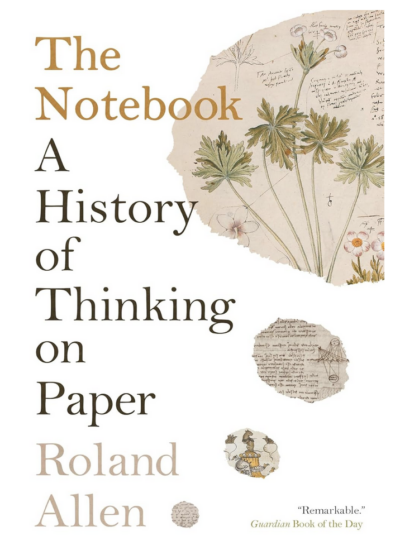
I recently finished reading The Notebook: A History of Thinking on Paper, by Roland Allen. I intend to post a more detailed review, but I really enjoyed it and I’m sure any other notebook enthusiast would too.
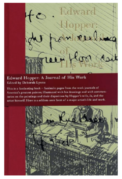
Another cool book I just discovered recently is Edward Hopper: A Journal of His Work. Many of the Edward Hopper sketches that you see online are from ledgers where he catalogued his paintings and how much he’d sold them for. This book contains full size facsimile pages from those ledgers. Unfortunately, this book is out of print but used copies are out there at reasonable prices.
The most recently published book that’s gotten me excited is Orhan Pamuk’s Memories of Distant Mountains: Illustrated Notebooks 2009-2022, which just came out a couple of weeks ago. I love discovering that an amazing author is also a talented artist!
The Work of Art: How Something Comes from Nothing is on my own Christmas list. It’s not specifically notebook-related, but notebooks do appear, as it is all about the creative process behind various great novels, works of art, music, etc. It’s heavily illustrated and I’m looking forward to immersing myself in it.
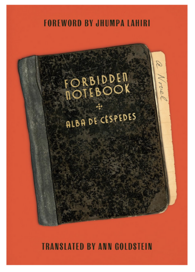
I haven’t yet read The Forbidden Notebook, by Alba de Cespedes, but I’ve been dying to ever since it came out. The title and cover alone are compelling, but it has also gotten rave reviews. It’s now out in paperback.
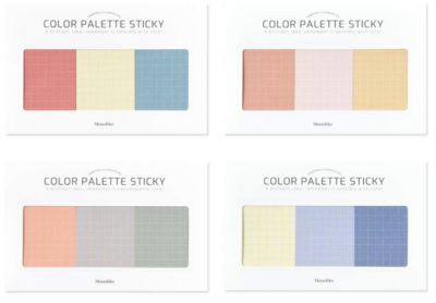
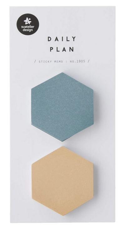
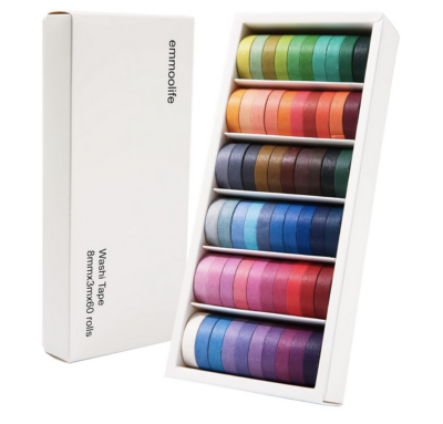
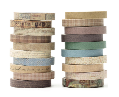
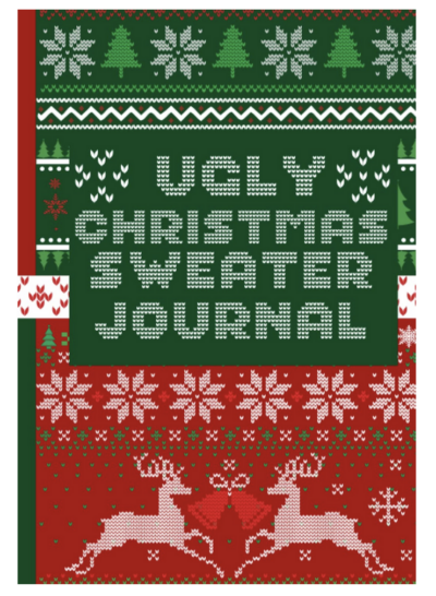
Obviously, I think books are the best gifts, and I have many other books about notebooks and facsimile sketchbooks I could recommend, but if your recipient isn’t a big reader, or if you’re looking for a small stocking stuffer, I think cute sticky notes are a great notebook companion. Here’s a few that caught my eye:
I’ve collected lots of other favorite items, including notebooks, pens, art supplies, books and more in my Amazon storefront. (These affiliate links earn me a small commission, which helps defray the costs of running this website.)
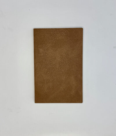
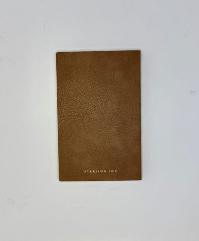
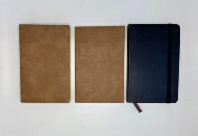
Sterling Ink is a brand I spotted on Instagram, thanks to the algorithms working as intended! I saw several posts mentioning their planners, and when I saw that they had a nice range of notebooks too, I couldn’t resist giving them a try.
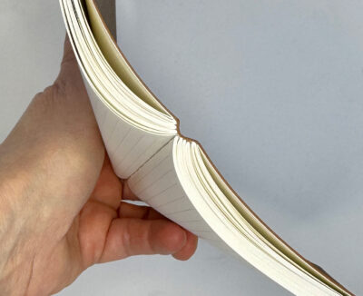
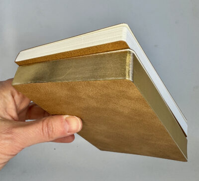
I bought two Sterling Ink notebooks in my favorite 3.5 x 5.5″ size, both in the caramel color. That and mauve were the only options currently available, though from their photos, it looks like there was a black option at some point. They come packaged in a clear plastic envelope. The soft covers are a textured faux leather, totally plain except for the brand name stamped in gold on the back.
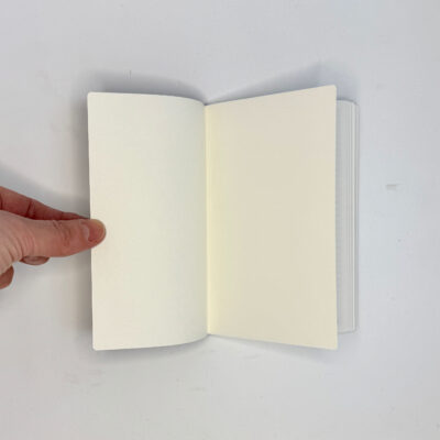
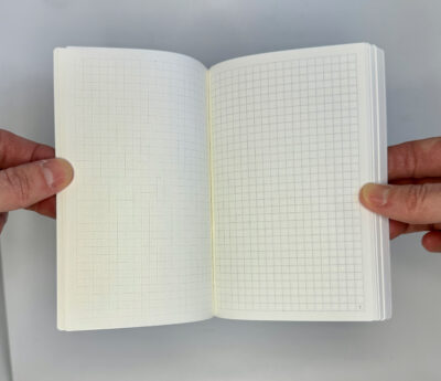
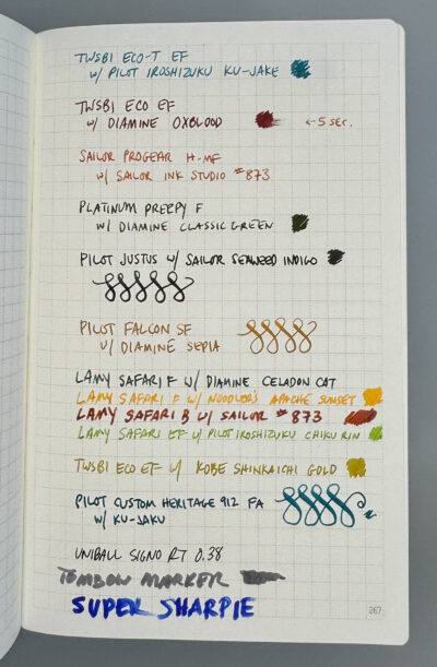
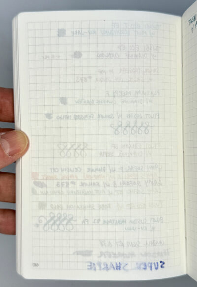
Inside the Sterling Ink notebooks, everything is completely plain. I chose the version with numbered grid paper, which is very pleasing to the eye– sharp, precise, minimal. The grid lines are dashed, spaced at 3.9mm, 20 squares by 33 squares with a plain border around the edges. The numbering starts on the second gridded page, and goes up to 269, as the 272 total page count includes blank ed pages. I would have started the numbers on the first grid page, but I guess this is done the way books are usually paginated, with even numbers on the left and odd numbers on the right. (I can’t believe I’ve worked in publishing for decades and never really noticed that.) Not a big deal either way. I love the font they used for the numbers, and the way there is a heavier dot at the top and bottom edge of the grid marking the middle. Everything seems very carefully considered.
The way the Sterling Ink notebook is constructed is also very nice– sewn signatures, which make it open flat and feel very flexible. The rounding on the corners is done to a very small diameter– a tiny detail that I always love, as it looks so much nicer than a big wide rounding,
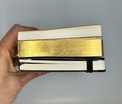
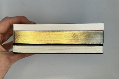
The 272 page notebook has plain white page edges, but the other one I bought is a 520 page version with gold page edges, which dress it up nicely. In every other way, the thicker notebook is exactly the same.
The paper used is Tomoe River paper, 52 GSM. It is dreamy to write on– so smooth and luscious. Fountain pens don’t bleed, though the fineness of the paper does allow more show-through than some other papers. The bright white paper shows off ink colors beautifully. I hated to desecrate this lovely test page with the nasty Super Sharpie, but I had to see if it would bleed through, since it pretty much bleeds through everything.
I really love these notebooks. The 520-page one is especially cute with its chunky shape. It’s the exact shape I wished for when I first tried the Hobonichi Techo, which was a bit oversize for me in its A6 form. The design somewhat reminds me of Hobonichi, as well as Stalogy— clean, minimal, sharp. (Sterling Ink’s planners also look great, with the same design sense and some nice layouts for tracking goals and habits.) It is wonderful to see such amazing attention to detail in a notebook– everything about these feels good, looks good, and seems incredibly precise. Great quality control.
Of course, great quality doesn’t come cheap: these are $22 for for the 272 page version and $30 for the 520 page version. I think these prices are fair compared to other fountain pen friendly, Tomoe River paper notebooks I’ve seen elsewhere. If you compare it to the Dressco Notebook I recently reviewed, (which is not Tomoe River paper but is at the same level of quality in many ways), the Dressco is more expensive at $0.11 per page vs. $0.06-$0.08 per page for the Sterling Ink notebooks. Galen Leather sells a 400 page B6 size Tomoe River notebook for $25, which works out to less per page than Sterling Ink’s 260 page B6 notebook at $21, but I haven’t tried anything from Galen Leather so can’t compare their quality.
I’ll be checking back to see if the black versions of these ever come back into stock, or whether they offer any other colors. The caramel is perfectly nice, but I can’t help it that I’m a boring person who mostly just keeps buying black notebooks over and over again! For others who have different preferences, Sterling Ink offers a variety of sizes and colors and page layouts for various planners and notebooks. Check them out at their online store.
In my trawling of various websites that sell Japanese notebooks, I’d often noticed a lot of listings for “household account books.” I figured using a notebook to track household finances must be common or traditional in Japan, but I never knew the full story behind it until I finally decided to do some research and discovered the Japanese word for these account books: Kakeibo.
Kakeibo can be translated as household account book or household financial ledger, but the word has come to mean more than just a book where you write your expenses. It’s a whole method of budgeting and planning your savings goals, introduced in 1904 by Japanese journalist Hani Motoko. Household spending was traditionally managed by women in Japan: husbands worked and brought home their salary to their wives, who then decided how the cash would be divided out and budgeted for various expenses. They used household account books to keep track.
Though gender roles may be less rigid today, the basic rules for tracking personal finances still apply. The Kakeibo method begins with setting a savings target. You record your income and fixed expenses for the coming month, and set a goal for how much you’ll save. Expense tracking is divided into 4 major areas, called “pillars”: Needs, Wants, Culture and Unexpected is the usual framework, but this could be adjusted to a particular user’s needs. I personally love that it prioritizes culture as its own pillar! Each week, you write down everything you spend, with the amount in a column for its corresponding pillar. Then at the end of the week and/or month, you summarize and reflect on where things stand, summarizing how much money you have, how much you spent, how much you saved, and how you can improve and save more over the long term.
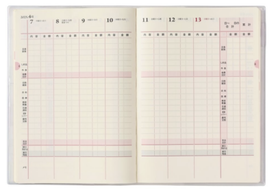
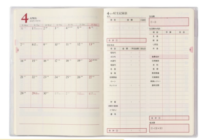
Hani Motoko’s method obviously became popular enough that the household account book became its own genre of stationery publishing in Japan. Though I could not find any information on early iterations of these notebooks or how they’ve changed over the years, a huge variety of them seem to be sold today. The designs still target women as you can see from the covers of these Pagem kakeibo planners.
The layouts inside vary– some allow for some appointment tracking but others devote most of the weekly layout to recording expenses. Each month has a page for a summary. Notes pages are also included
Pagem weekly layout with space for appointments and simple expense trackingPagem weekly layout with more space for expensesPagem monthly summary layout
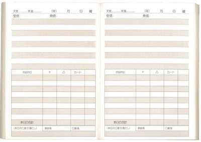
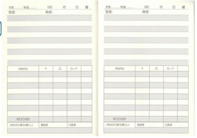
Below are some layouts from an undated Hakubunkan brand kakeibo planner:
There are, of course, lots of other ways to track your spending and saving and budgeting. I used to jot various notes about my spending in paper notebooks back in the 1980s and 1990s, though I wasn’t very methodical about it. I’d also go through all my records a few times a year and assess the bigger picture, adding up long lists of numbers. When I discovered Excel, those lists became spreadsheets, and when I got a Palm Pilot I started tracking all my expenses in an app that synchronized with a desktop program. This is one area where digital tracking has served me well and I’ve never looked back. But I do still jot a savings goal in my planner every year. And reading about the Kakeibo method is making me wonder if I should be using my notebooks to track my finances in more detail, at least in terms of a monthly recap.
Nowadays there are apps for Kakeibo too– but the key thing about the Kakeibo method is how it incorporates mindfulness and reflection about spending. And just as writing by hand in paper notebooks and reading paper books can help you retain information better, devotees of the Kakeibo method say that the act of writing their spending and savings goals in a paper account book helps them improve their money management and save more. Makes total sense to me!
If you want to learn more about Kakeibo, these books have more information about the method:
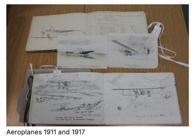
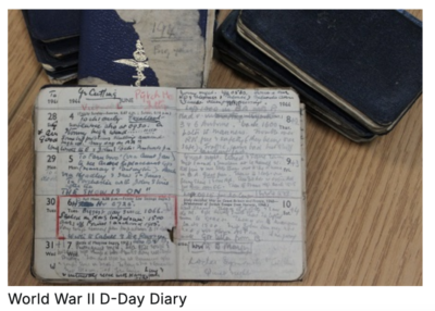
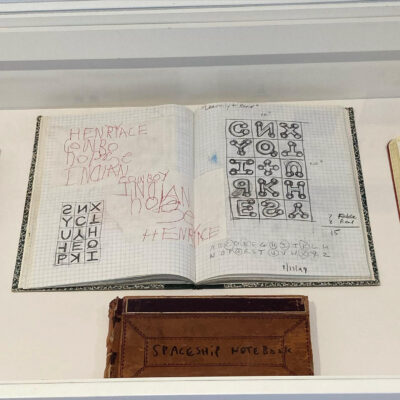
I came across a very interesting post on the website of the Wiltshire and Swindon History Centre. Their Heritage Education Officer Ruth Butler writes about working on a commemoration of the 100th anniversary of the Battle of the Somme, in 2016. She found what she describes as “a treasure-trove of sketchbooks, diaries, letters and photographs that belonged to Hetman Jack Parham.”
“It turned out there weren’t just one or two sketchbooks, there was a whole box-full that charted Jack’s career from a young subaltern in the Royal Artillery at the outbreak of the Great War to his most senior command postings as a Major General at the end of the Second World War.
The sketches are beautiful. They are also packed full of information, a detailed record of the fighting landscape of two world wars and an insight into an artillery officer’s mind.”
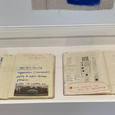
A few years ago, I went to an exhibition of art by Karla Knight, but for some reason have never gotten around to posting about it til now. Her work is very interesting, full of strange symbols and spacey-looking shapes. But of course I was especially intrigued since some of the exhibition included notebooks! I snapped a few photos of these drawings done in what seemed to be old ledgers, composition books and lab notebooks.
There were also large scale paintings and drawings, so I think these notebooks were just preparatory sketches but I love them just as they are!
You can see more of Karla Knight’s work on her website.
If you’d like to see notifications about my posts on Bluesky, now you can! I just realized dlvr.it had stopped posting my updates to Twitter-I-mean-X and Facebook about a month ago, so it seemed like a good time to jump on the Bluesky bandwagon. I probably won’t be posting very actively but there will at least be notifications when new blog posts are available, assuming I’ve got Zapier working correctly!
Here’s a some random notebook photos just for the heck of it.
It’s been a long time since I embarked on any crazy notebook modification adventures. But every once in a while, I get a bee in my bonnet about a notebook that is just soooo close to perfect except for this one little thing… and if it seems like something I might be able to fix, I am compelled to try it.
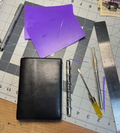
This time, it involved an older Filofax, a pocket Grosvenor from 1999 that I bought in excellent second hand condition. It’s made of a gorgeous soft leather and has nice pockets and is pretty much perfect except that it’s wider than my preferred shape. It also has very small rings (11mm). It reminded me a lot of my two pocket Chelsea Filofaxes, one of which has small rings and one which has larger rings (about 17mm). The extra thickness added by larger rings makes the cover of the Chelsea less wide when it’s filled. And I also had it in mind to use as my new work notebook, where the larger capacity would be needed. So I started thinking of how I might be able to swap out the rings in the Grosvenor.
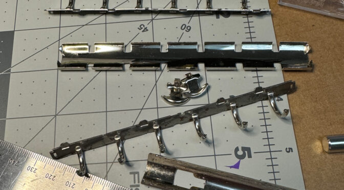
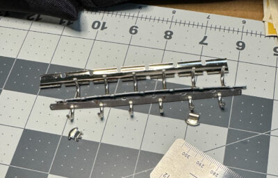
Filofax pocket sized organizers with the small rings have small metal tabs that hold the rings to a backing plate under the leather. Although my pocket Chelsea uses the same attachment tabs for its larger rings, I haven’t been able to confirm whether any other Filofax models used this method for larger rings. Most pocket size organizers use a different method where two little brackets on the backplate slot into the base of the ring mechanism, or they have two rivets that go all the way through the cover, attaching it permanently.
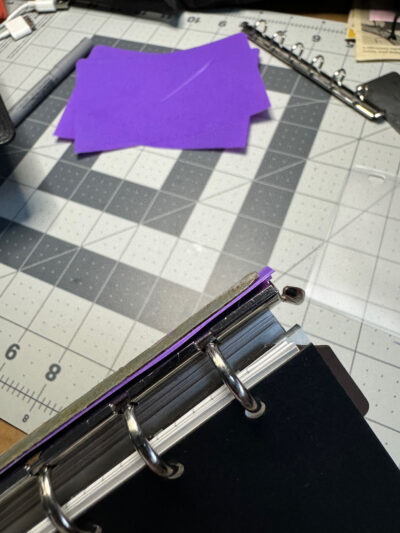
I thought I might still be able to attach a set of larger rings from an older pocket Filofax, so I bought a cheap old grungy one just to use for parts. I could also have just bought a set of brand new Krause rings from various sources, but it was good practice to remove the rings and cut the cover open to remove the backplate. Unfortunately I didn’t take pictures of that operation! But it led me to discover that the base of the larger ring mechanism is a different length– too short to allow the backplate tabs on the Grosvenor to hold onto it. Most Filofaxes with small rings have a 13cm backplate, but the ones with larger rings are around 12.5cm to 12.7cm from what I’ve seen.
I couldn’t see how I could possibly come up with a way to lengthen the base so it would reach the tabs, or lengthen the tabs to meet the base. I almost gave up on the project. But I decided that the next best thing would be to attach the rings to a thin sheet of plastic and then insert that in the Grosvenor’s pockets. I have another notebook in my collection that was actually made this way, in two separate pieces so the rings and the plastic inner cover were separate from the leather exterior cover–which I promptly swapped for a different one.
For Grosvenor project, I used a plastic folder that I happened to have at home, measuring out the size, and marking where the holes for the brackets of the ring base would need to go. With a little fiddling with an Xacto knife, it actually came together pretty well!
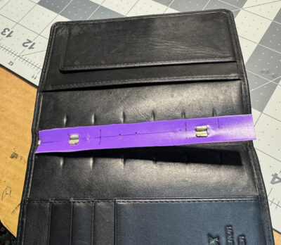
I then had to remove the small rings that were in the Grosvenor. I used the same method of taking the rings apart, but found it more difficult due to the small size of the parts. No matter what size the rings are, the metal pieces have rather sharp edges so you really have to be careful!
When it was time to try to pry the tabs open a bit to release the base of the ring mechanism, I heated them up a bit with a hairdryer, in the hopes that the warmth would make the metal a little more soft and flexible and less likely to break. It was hard to get my little screwdriver under the tabs, but I eventually managed to loosen one of them enough to be able to slip the ring plate out.
Then it was time to insert my plastic ring holder, but once I fitted it into the leather cover, I realized there was a problem– the plastic didn’t want to stay bent and the organizer was flopping open. I took the plastic out and folded it along the spine, which helped, but it still wasn’t quite right. (It’s Not Right But It’s Okay was running through my head the whole time!) I trimmed the edges a bit more, and trimmed some bits of plastic that were sticking out on the back, but it became obvious that this just wasn’t going to work very well. It was also really ugly having all this purple plastic inside my beautiful Grosvenor! Not okay at all.
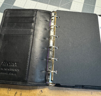
So I tried one more thing: I sliced the purple plastic covers away completely, leaving only the spine part that was sandwiched in the ring mechanism– this piece was actually the perfect length to fit under the backplate tabs. And sure enough, when I carefully pressed the tabs back down again to hold it in, it actually worked!
The rings seem to be held in pretty securely, and I now have a Grosvenor with larger rings. It still might not be exactly right, but it’s more than okay! The subtly different proportions are more to my liking and it has a nice chunky feel like my old Chelsea, with tabbed dividers just barely fitting inside the cover. Since there’s an extra layer of backplate, things are pushed a bit further out from the spine than they should be. For most inserts it doesn’t matter, and normal index tabs sticking out just a hair isn’t too bothersome. But unfortunately, the top-opening plastic envelope I wanted to add was too wide and stuck out quite a lot– the envelopes they sell now are a lot wider than the 1990s ones in my collection, which is annoying.
Modified Filofax Grosvenor on top, Filofax Chelsea on bottom.
On the downside, I can’t say I have total faith in this ring attachment method passing the test of time. It seems like the purple plastic could easily slip out or tear or wear out. But we’ll see how it goes. My intended purpose for this notebook may be mostly at-home use, so it won’t have to survive being tossed in a bag very often. If I decide it’s not working, I could almost imagine trying to open up the leather on the inside of the spine to see if I could swap out the backplate, actually gluing the wider one under the leather and then sewing it back shut… but I think that might be a more radical surgery than my nerves could handle! I’d probably just reattach the original small rings, praying that being bent back and forth again wouldn’t break the tabs. This whole project deserves a “don’t try this at home” warning, but I’d also say “don’t try this anywhere in public if you’re embarrassed to be seen crying!”
Now you might be thinking “how could she risk destroying such a beautiful and rare vintage Filofax?” Believe me, I struggled with this question too. If I broke the tabs and couldn’t attach any rings to it, the cover on its own probably could be used as a holder for passport-size notebooks, but still, it was really worrying me that I could potentially ruin a very nice item that I’d never be able to replace. That’s why I didn’t allow myself to do this Filofax modification until I’d miraculously managed to buy a second vintage Grosvenor in even better condition! That’s what I call a back-up plan.
Filofax Grosvenor: modified on left, original on rightFilofax Grosvenor: modified on top, original on bottom
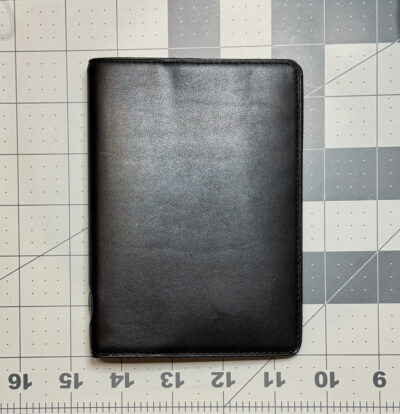
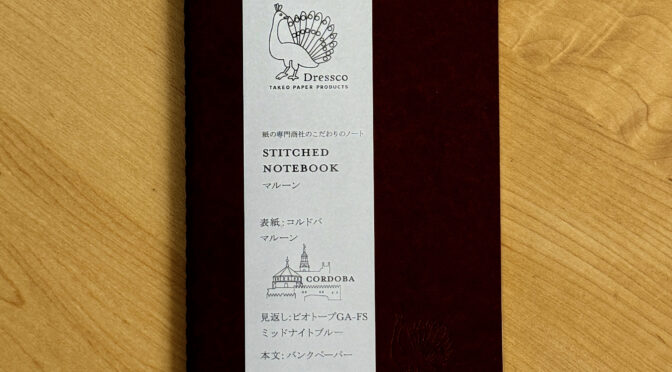
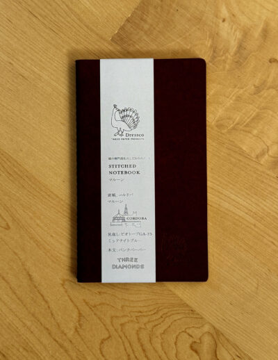
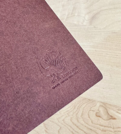
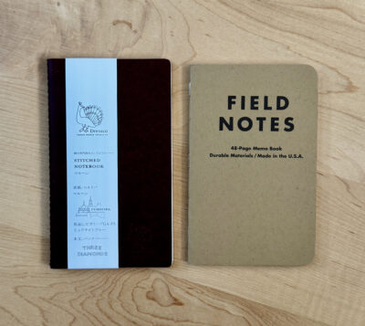
I have to confess that I bought this notebook mainly because I was feeling a little frustrated. I’d made a trip into NYC and was all excited to go to Goods for the Study and browse through lots of fabulous stationery… but then when I got there, I didn’t see anything that I really thought was new and exciting. “Been there, done that, meh,” is not a sensation that I want to experience in a stationery store, but I guess when you’ve been blogging about notebooks for 16 years and collecting them for 50 years, it’s bound to happen sometime! There are only so many ways to make a notebook new and exciting. But I felt like I couldn’t leave empty handed, so I decided to buy something lightweight and (relatively) inexpensive. I chose this Dressco Stitched Notebook.
It’s actually pretty adorable. The packaging is very elegantly designed (and mostly in Japanese). The shape is a bit unusual but it’s slim and pocketable, also quite elegant. And you can tell right away that like so many Japanese notebooks, this is made with a high level of attention to detail and quality.
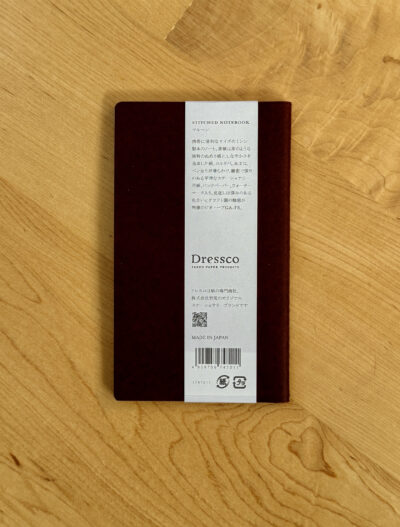
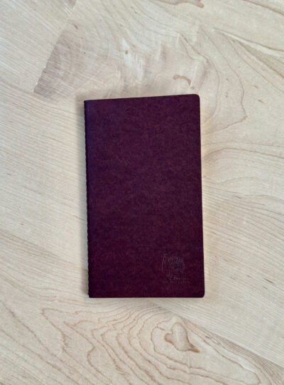
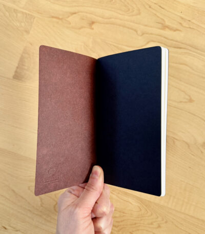
The outside of the notebook is a rich brown paperboard with a bit of a mottled tone to it. It’s not very thick but feels a little heavier than the usual cover of a Field Notes. The peacock logo that appears on the paper band is also blind stamped on the cover. The dimensions are “A6 slim,” 85 x 145mm, and about 5mm thick.
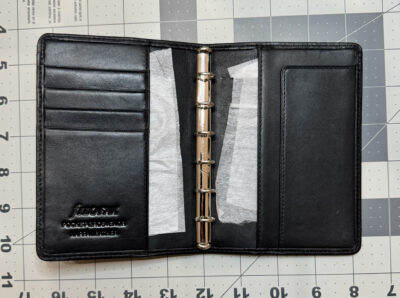
The cover wraps around a single signature of paper, held together by precise stitching running up the spine. Inside, there is one black sheet of paper at the front and back, and then 88 pages (44 sheets) of creamy white plain paper. I had trouble finding information in English about the paper, but I did see one online retailer describing it as “Ink-friendly MITSUBISHI Bank Paper.”
The paper feels smooth but not glossy-smooth like Tomoe River paper, there’s a little bit of feedback. And it is indeed ink-friendly! Show-through is a bit more than average because the paper is quite fine, but there is no bleed-through. I would love to see how this notebook looks when it’s completely filled with beautiful small handwriting in a variety of fountain pen ink colors– I’m sure the overall layered effect would be gorgeous.
So I ended up loving this notebook despite my jaded attitude when I bought it. Notebooks don’t have to be new and exciting to make me happy– precise construction, quality materials, and simple, elegant design will do the trick! I’d prefer that it was more in line with all my other 90 x 140mm notebooks but I’m willing to be a little flexible sometimes.
At $9.95, this Dressco notebook costs a lot more than a Field Notes or a Moleskine Cahier. But it’s an elevated writing experience, more in line with the Pebble Stationery pocket notebooks I reviewed. Those were $9.95 for a two-pack when I wrote about them in 2019, and are now listed at $10.95, though they are currently out of stock. Lochby’s Tomoe River pocket notebooks are $23.99 for a 4-pack. I can’t think of any other pocket notebooks that are as expensive per page/square inch as the Dressco Stitched Notebook, other than maybe Jet Pens’ A5 size Tomoe River notebooks. But if you want to save a few bucks, the best deal on the Dressco notebooks seems to be a 4-pack of assorted colors in a slipcase. The cover texture looks like it may be different, but they do say they have “bank paper.” And at the current price of $31.27 at Amazon, it’s almost a bargain!
Notebooks, journals, sketchbooks, diaries: in search of the perfect page…