Happy 2026! I can’t claim to have any major new notebook plans to report for this year: I’ll be sticking with the tried and true. But sometimes, even the tried and true changes a bit.
This will be my 9th year of using a Nolty Efficiency Notebook. I’ve really gotten into a groove with Nolty’s format, finding it works very well as a daily companion where I can track habits, log food and exercise, note appointments, and keep track of various tasks and lists. I also like using it for a sort of yearly overview– recording resolutions and looking back at how I did on them, and keeping a list of all the books I’ve read that year. (See How I Use My Nolty Planner and 2025 Planner Set-Up for more details.)
Nolty’s design seems to have been extremely consistent, probably for far longer than I’ve even been using these planners. But I did notice some changes this year.
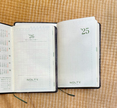
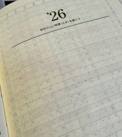
The most immediately noticeable was the cover page design– it makes zero difference to the function of the notebook, but for some reason, they redesigned the layout so the year and Nolty name are centered. In between there is a dot-grid area bordered by lines at the top and bottom– it’s quite subtle and I didn’t even notice it at first. The grid is 19 dots wide and 19 dots tall, with the middle dots on each edge, and the center dot being bolder. Underneath the year is a line of Japanese characters that Google translates as “draw your own time.” Nolty seems to have added this cover page design to all their planners, and I’d be really interested to know how they suggest people use this. From what I’ve seen online, it’s meant to be free form, and perhaps for recording goals or challenges or a vision board, but I haven’t yet seen any examples of how people might actually be using it. The previous blank page could have been used to write these things all along, but I guess the grid is nice if you want to have a bit of structure. Honestly, I’ll probably just leave mine blank!
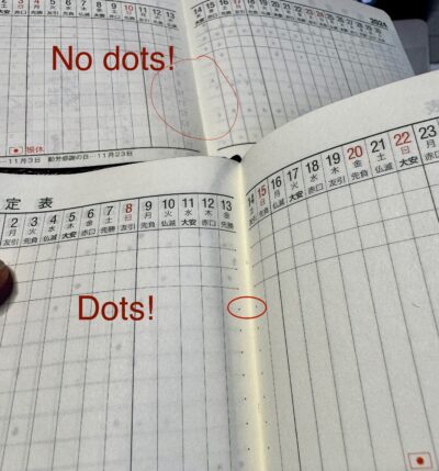
The other slight redesign is something so tiny I almost missed it, but I’m actually extremely happy about it! There are now dots on the spine edges of the Gantt chart. The chart has a few horizontal lines at the top, and then blank space below where you can add your own lines if you want. I always do, and it drove me crazy that they were always a little crooked because there was no dot on the inner part of the page, and if you tried to lay a ruler over the two-page spread, the pages wouldn’t lie flat enough for the line to stay straight near the gutter. Now I can line up the ruler nicely on each page. Anal OCD people of the world, rejoice!
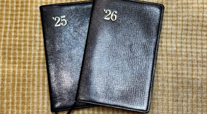
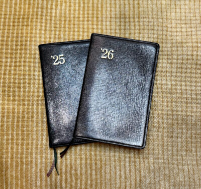
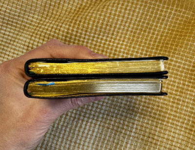
On the downside of Nolty’s subtle changes, my 2026 Nolty Gold has a bigger cover overhang– I doubt this is a conscious design choice, more of just a variation in manufacturing. The cover also seems a bit tightly bound, making the spine a little lopsided and not leaving the extra space needed for the added booklets in the back. (It’s hard to see in the photo below, especially because my 2025 Nolty only has one supplemental booklet in it now, and the 2026 Nolty has two.) It may just need to break in and get floppier but the binding, at least on mine, definitely doesn’t seem to have been done quite as precisely as last year’s. I’ve always found Nolty’s quality control to be top notch, so this is a bit disappointing.
Otherwise, as far as I can tell this is exactly the same Nolty Gold I’ve come to know and love. And I hope they’ll keep it that way!
Isn’t it comforting to use the same planner format, year after year? I wrote a guest post for the Well-Appointed Desk about the Leuchtturm I’ve been using for many years: https://www.wellappointeddesk.com/2026/01/my-planner-a-comforting-lack-of-change/
Yes! I saw that post and loved the way you varied the colors. I bought the regular non-leather Nolty in green one year, and kind of wish they did the leather version in different colors… but sticking with black is also pretty comforting for me!