Rediscovering Notebooks

I loved this blog post in appreciation of using notebooks. The author talks about how she used notebooks as a kid, but gave them up as she grew older, feeling that it was somehow immature to be scribbling down her thoughts and ideas and the emotions of youth. But fortunately, she came back to the fold:

So after 4 years notebook free, I again relinquished myself to the pages of a notebook. Consequently, I felt more creative. It actually helped me with my job, and eased the worries and stress I felt. Writing, sketching and purely playing in my notebook for 20 minutes a day gives me some space in this crazy world. And do you know what the best part is? When I look back on them now, I see the PROOF of how much I’ve changed and how far I’ve come. I see that I made it out from that dark period between 12 and 16 and I became something more. Hopefully something better. And aiming to be something I’m very proud of. It’s a source of encouragement, and, in another 10 years, I hope to see even more of a departure from that first teenage scrawl.

I guess that at the end of the day, a notebook helps me be grateful for the small things, and that’s no bad thing. In the same way that space makes me feel insignificant, studying the small building blocks of life in a notebook that attribute to the happiness I feel makes me feel whole.

Read more at Mab is Mab: Rediscovering notebooks.

Review and Giveaway: Elan Pocket-Size Field Book

I’ve been rather fascinated by field books lately. I first owned one when I was in college– I forget where I bought it, but I stumbled on it in a store, thought it looked cool, and ended up using it for some art classes where its durability came in handy.

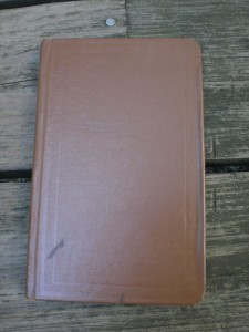
I hadn’t thought about it in years and then was reminded of it while going through boxes of notebooks and realized I actually owned a notebook that had the same interesting paper used in the work of David Fullarton:

I poked around and found these notebooks for sale at Engineer Supply: Elan Field Books. The standard field book size is about 4 1/2 x 7″, which is not a size I used very often any more, but I got all excited when I saw that Elan offered a smaller “pocket size” field book. At 4 1/8 x 6 1/4″, it’s not for very small pockets, but I couldn’t resist– I had to buy some. And yes, I really did have to buy “some.” Unfortunately, Engineer Supply only sells these by the 6-pack, and at $8.25 each, that ended up being a bit of an investment. But it’s all for the good of my readers, and means I have some extras to give away!

So let’s take a look at what I got:

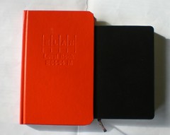
I have to say, I was disappointed at how large the notebook ended up being. The actual exterior measurements are  4 5/16 x 6 13/16″ and the page dimensions within are 4 1/8 x 6 1/2″. That’s a pretty big discrepancy with what was promised. The Elan field book is shown below with a pocket Moleskine for comparison.

And boy is that cover a bright orangey red! I guess it makes sense, though, as my old muddy brown one could easily get lost in the woods, but this one never would!

elanfieldbook01elanfieldbook02


elanfieldbook10elanfieldbook09


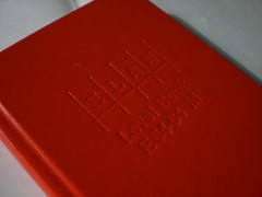
You’ll also notice my other major disappointment: a HUGE cover overhang. Yuck. My old field book had almost none.


elanfieldbook03
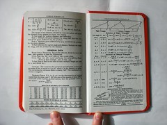
But inside is where we get to the good part. Inside the front cover, there’s a space to write your contact details and the contents of the book. On the inside back cover, you get a few fun bits of mathematical information that most of us will never use. The pages within are a nice red and blue grid pattern, which is a good compromise between line and graph. The columns would be handy for jotting numbers. The page layout I chose is actually called a “Level Book” but you can also get a “Field Book” that has this page style on the left, and a smaller grid pattern on the right, similar to in the Fullarton image above.

elanfieldbook04elanfieldbook06
elanfieldbook05

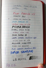
The notebook opens quite flat, due to a somewhat loose binding. The paper has a smooth feel and fine point gel pens feel great on it. Fountain pens worked well, though my Uniball Vision Micro feathered out a bit. Show-through is not all that great, though bleed-through is better than average. The paper is acid-free.
elanfieldbook07elanfieldbook08


From the Engineer Supply description:


Features:

  • High visibility, extra stiff orange hardbound cover
  • Completely protected by a waterproof barrier with blind embossing
  • White ledger paper has a 50% cotton content and is specially formulated for maxiumum archival service, ease of erasure and protected by a water resistant surface sizing
  • Ruled light blue with red vertical lines

Specifications:

  • Number of pages — 160 pages (80 sheets)

  • Page size — 4 1/8” W x 6 1/2” H

  • Grid layout on the left — 6 vertical columns

  • Grid layout on the right — 6 vertical columns

So for the bottom line, I definitely didn’t find this the field book of my dreams. I would really love a smaller one, with no cover overhang. Then I’d buy them by the half-dozen, or dozen, or gross, maybe! But as is, they’re still pretty good, depending on your needs, and they’re not too expensive. As noted above, you can buy them online in packs of 6 from Engineer Supply, or one by one via Amazon.

And I have a few extras to give away! I’ll select 3 lucky winners from entries received in these ways:

On Twitter, tweet something containing “Elan Field Book” and “@NotebookStories”, and follow @NotebookStories.

On Facebook, “like” the Notebook Stories page, and post something containing the words “Elan Field Book” on the Notebook Stories wall.

On your blog, post something containing the words “Elan Field Book” and “Notebook Stories” and link back to this blog.

The deadline for entry is Friday Feb. 8 at 11:59PM, EST. Good luck everyone!
And please remember to check my posts on Facebook and Twitter for an announcement of the winner.

Moleskine Monday: Grand Central Terminal Centennial

A Moleskine book to commemorate the 100th anniversary of NYC’s Grand Central Terminal, which opened on February 2, 1913.

The book features winners of a drawing competition sponsored by the Architectural League and the New York Transit Museum, including these:

Nicholas Venezia


Christine Zavesky


See more at The Architectural League of New York | A Centennial Sketchbook for Grand Central Terminal.

Notebook Addict of the Week: Aurelia

This week’s addict emailed me from France to show off this lovely annotated photograph of part of her colorful collection:

I wanted to send you my notebooks, but not all my collections “only” the one I use for the moment !
1. ideas book
2. Craft projects
3. What to see/to do/to buy when I’ll travel in the USA
4. Passwords book
5. Blog ideas
6. Wedding inspirations
7. Citation book
8. Scrapbooking projects
9. Job projects
10. Art Photography Projects
11. Project life diary
12. Project life
13. Notebook
14. Baby n°1 diary
15. Baby n°2 diary
16. Diary
sans titre-8406 copy


I was curious about #14 and 15– nice colors, and I liked the chunky shape. Aurelia tells me they are from a collection called Quo Vadis Memoriae, which unfortunately don’t seem to be part of the US product line, but are available in Europe and the UK.
Thanks/Merci for sharing your addiction, Aurelia!

100 Years of Diaries

Wow, I can’t believe I never heard about this gallery show when it was in New York this past fall: Dylan Stone’s 100 Years project at Ruth Phaneuf Fine Arts. I found out about it via a recent post at Design Observer:

The Twentieth Century began on the morning of the 20th of August, 1900, when an anonymous boy was taken by his father to the Simcoe train station. He boarded the 8:03 train and arrived in Toronto at 11:30. The event that shook the world? “Met mother.”

So begins the history of the last century as seen through a collection of pocket datebooks — one for each year — assembled by the British artist Dylan Stone. It took him three years to collect the diaries from flea markets, eBay auctions and estate sales. They were on display recently in at the Ruth Phaneuf gallery in New York City, along with a century’s worth of printed invoices and programs (mostly from theater and film openings). Conceptually, these three collections reflect a century of printed material gleaned from the perspective of commerce, entertainment and the realm of the everyday.

The datebooks are the most compelling. As physical objects, they trace a trajectory from the leather-bound, embossed and marbled first half of the century to the pleather-covered planners of the 1980s and 1990’s. They tell the story of fastidious cursive handwriting giving way to block lettering, of hand-made production giving way to mass production, of elegance devolving into kitsch. As printed artifacts, this is a familiar trajectory, which, depending on your point of view, will either evoke a nostalgic sigh of despair or a satisfied haarrumph at the triumph of Staples-like efficiency and cost-effectiveness.

This is a photo of the installation in New York:

I’m quite inspired that it only took him 3 years to collect these– there must still be some gems out there for me!

Moleskine Monday: Reviewing My Latest

It’s been a while since I actually reviewed a Moleskine notebook, and with all the concerns about quality going downhill, I thought it might be a good time to look at one I am currently using, a plain pocket size notebook (with regular paper, not sketchbook weight) which was purchased in recent months.

This is the notebook I posted about recently to call attention to the smaller page size and larger cover overhang. Since then I have been using it as my daily notebook. I continue to find the extra overhang at the corners annoying. The other issue I’ve noticed is that the corners seem to be fraying more than on other Moleskines I’ve used. The corners at the spine have really not held up well. This has happened to a few other notebooks I’ve used, mostly ones bought in recent years. I’ve only been using this notebook for two months, and have only gone through about half the pages, so the deterioration seems to be happening faster than usual. I definitely have older Moleskines that were used over 6 or 8 months without ever showing this kind of wear.

2012moleskine 62012moleskine 72012moleskine 2

One of the outside corners is also wearing down– the black wrapping has rubbed away to expose the white board underneath. I wonder if they’ve changed the material they use on the outside– I noticed this one feels a little waxier than others I’ve owned.

2012moleskine 3

I also did all my usual pen tests. The paper still feels great to write on. The smooth surface is really nice with fine point pens. I was also surprised to see how well it worked with my fountain pens, with no feathering or bleed-through at all. But it’s the other side of the page that shows the problem– pretty bad show-through and lots of bleed-through with some other pens, worse than any other notebook I’ve tested in a while.

2012moleskine 42012moleskine 5

It’s really disappointing to see Moleskine’s quality slipping in all these little ways. When I was using some of my Piccadilly notebooks, I barely noticed similar issues because the $3.99 price point lowered my expectations. But for a $12 notebook, from a brand that has at least somewhat built itself on quality, I would expect better. Given that the Moleskine company has grown bigger and now seems to be caught up in private equity transactions and going public on the stock market, I can’t say I’m optimistic that things will improve– I’m sure they’ll be cutting more corners to squeeze out more profit.

Notebook Addict of the Week: Renee

This week’s addict emailed me a photo of her collection and says

“Since I work all day at my computer doing medical transcription, I usually prefer to get away from the computer at the end of the day and do my creative writing longhand in various journals (for the first drafts, anyway). The journals in this photo are the ones I haven’t used yet… or, well, _most_ of the ones I haven’t used yet, since I’ve gotten a few more since this photo was taken. :) “

journals small

I think I see Paperblanks, Markings, and Piccadilly. I like the consistent color palette of this collection– though there are reds and blues and greens and browns, the tones seem to fit into the same family. They look very nice together, complementing the couch perfectly!

Thanks for sharing your addiction, Renee!

Notebooks, journals, sketchbooks, diaries: in search of the perfect page…