The Christmas Notebook Tradition

A sweet notebook story for Christmas! Happy holidays to all!

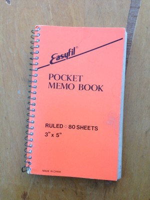
Every year around the end of November, my family starts decorating for Christmas. There are trees (yes treeS) and lights, ornaments and Santa figurines, but my favorite thing is a little orange spiral notebook. Let me explain…

When my parents were married, almost 36 years ago, my Dad had just enlisted in the Navy. As luck would have it, he got his first set of orders right at Christmas time. Unfortunately, this meant that every few years my family had to pick up and move across the country right at the height of the holiday season. Well, this did not sit well with my mother who worried about never being able to recall which location we were in each year, and thus the Christmas notebook was born!

Read more: The Christmas Notebook: The Christmas tradition from a semi-nomadic family | Offbeat Home & Life

Review: Samsill Pocket Journal

Samsill is another brand I’d not heard of until browsing around on Amazon. The company is an independent manufacturer of business accessories such as ring binders and laptop cases, founded in Texas in 1953, and now making their products in partnership with manufacturers in China and Mexico, while still maintaining headquarters and some manufacturing facilities in Texas. Their company history is actually quite fascinating.

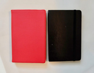
I didn’t know all that background about the company before I ordered, but from what I could see online, this notebook seemed worth a try: 3.5 x 5.5″ format, red cover with stitched edge, and at 240 pages, it has a sort of thicker look without too much overhang. Shown with a pocket size Moleskine for comparison below.

When my order arrived, I thought the notebook looked pretty good– everything noted above was true to the description. The bright red cover feels nice and substantial. The wide elastic band seems sturdy, and it’s tight enough to sit neatly on the back cover without flopping around when you aren’t using it. But then the dream started to die…

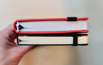
First I noticed the headbands– I prefer not to have these at all, since they are almost always decorative and don’t add any strength to the binding. To me it just looks stupid to have a little string glued on there, and on the Samsill notebook, it looks particularly bad as they are rather frayed.

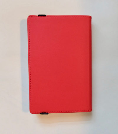
I also noticed that the elastic closure is attached in an unusual way– it goes all the way over the top and bottom of the cover and is stitched on, and presumably glued under the back cover. Maybe this is stronger than the way most elastics are attached through holes in the back cover, but it seemed like it might cause the stitching to come loose over time. There is no pocket in the back.

This is how the back cover looks when the elastic is wrapped around the front of the notebook:

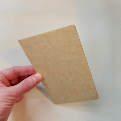
When you aren’t using the elastic to hold the notebook closed, it looks like this on the back:

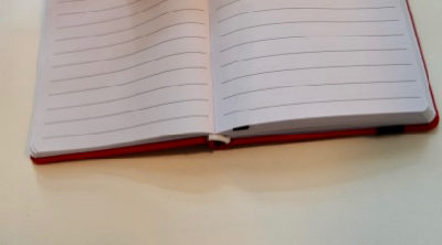
It’s when you open the notebook that the disappointment increases.  The binding is really stiff, and there is an extra piece of cardboard under the endpapers that makes it feel like you’ll break the binding if you open it all the way. Once you’ve crushed it open and flexed the spine a bit, the notebook does open fairly flat, but it offers a lot of resistance against staying open, and after you’ve opened it, it won’t stay closed all the way without using the elastic.

The cool white paper has relatively dark lines that do not go all the way across the page, and there is a wider header space at the top. I wish I could say that the paper made up for this notebook’s other faults, but alas, it did not. Fountain pens, and many others, were feathery messes. There was slightly more than average bleed-through. Show-through was about average. My favorite gel ink Uniball Signo RT 0.38 pen felt great as the paper is quite smooth, so if you only use this or a Pilot G-2, you’d be fine.

I was shocked to see that the black pocket size version of this notebook currently costs $21.50 on Amazon! Amazon often has some weird price fluctuations, but that is pretty shocking, given that the red pocket version is only $8.42. (I paid $8.95 when I ordered mine, about a year ago.) Blue and green are also available, as are larger sizes– strangely, a 7.5 x 10″ black notebook is only $5.56 right now! A dot grid version is available, though currently only in a medium size. But honestly, I can’t really recommend that you buy this notebook unless you plan to just hold it in your hands and never open it. One other possibility could be to cut out the paper and use the cover to bind some other paper– I am seriously considering trying this to see if the binding can be made more flexible.

After learning about the history of the company, I really wanted to like the Samsill notebook more– I’m always happy when I find an American stationery company that hasn’t been swallowed up in corporate mergers. Journals don’t seem to be a major part of their product line, but it would be nice if Samsill tweaked their notebook design a bit to improve the quality while maintaining the mostly attractive and sturdy exterior.

“Leuchtturm1917 is Breaking My Heart”

A regular reader contacted me to share her woes about her favorite notebook brand: Leuchtturm 1917. I’ve reviewed this brand but never used one long-term, so I was happy to be able to share the thoughts of someone who has had more experience with Leuchtturm over the years:

I thought it might be interesting to update you on my current experience with this brand and how the notebooks have lasted over the years. My go-to notebook is the softcover pocket Leuchtturm1917. I initially found one with a white cover in a local bookstore and fell in love with everything about it, in particular the fact that it lies flat and has creamy off-white paper that is very lightly lined and feels soft to the touch. After that I purchased quite a few more from the Kikkerland Design website, which they no longer carry.  For a while they even had a light blue softcover version available in pocket and medium size, which I suspect were their “trial” designs that probably did not see enough sales and were discontinued. Softcover Leuchtturm1917s are now sold in a variety of colors, but I have yet to find another softcover in light blue or white; however, the cover color is the least of my woes. I have witnessed how over the course of only three years the Leuchtturm1917 has slowly met the same fate as the Moleskine brand. Sadly, they too have drastically declined in quality. In my humble opinion, Leuchtturm1917, whose motto is “Details Make All The Difference,” dropped the ball and is breaking my heart. 

The very first batch of Leuchtturm1917s I have feel like an entirely different notebook compared to what is currently available. This goes for online orders from Amazon or the Leuchtturm1917 website. Even in my travels I have noticed these notebooks are all facing the same fate world-wide. They now have the double bookmark, but apart from that supposed improvement everything else about the notebook has taken a turn for the worse. 

The current Leuchtturm1917s have a stamp on the last page that reads “Made in Taiwan,” whereas the original ones did not have any markings as to where it was made. I recently tried out a dotted softcover version and noticed the stamp now reads “Made in China,” and this version has the worst paper and horrible binding that no longer lies flat. In fact, the notebook is so poorly constructed that the cover does not close at all. The binding appears to have more signatures than the original ones, but still the same number of pages. The paper is just plain white and has a rough texture like a regular sheet of paper, and the lines/grid/or dots are all much darker than before. The hardcovers I’ve seen in stores all have cover overhang, a pet peeve you and I both share! Interestingly, I even noticed the older Leuchtturm1917 weight a little more than the new ones, further proving that they have switched to cheaper paper but still charge the same price.

I had written to them on their website to bring attention to the quality issue, but have yet to receive a response. This reminded me of your posts about the Moleskine brand and how you were on a quest to find the “good” ones after they declined in quality. I am afraid Leuchtturm1917, just like the Moleskine, are becoming mass produced and no longer the same great notebook it was when it started. 
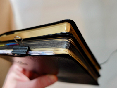
I have included some photos of my collection to demonstrate comparisons of the old Leuchtturm1917 and the new, unimproved.

A coworker of mine recently showed me her new Leuchtturm, having not used one before, she thought it is great but I could see the decline in quality. Sometimes I think brands do not really care about disappointing long term users of their products, because a lot of “newbies” who don’t know what they are missing out on come to replace us in greater numbers. 
I am glad I have my little stash of the old versions and just wish I had saved more, had I know this would happen.

I can’t say I’m surprised. I’ve read that the cost of paper has increased a lot recently, and I’m sure every notebook brand is struggling to stay competitive. I’ve written quite a bit about Moleskine’s declines in quality, and in recent years I’ve noticed other brands like HandBook Artists Journals where the stock in stores is not as nice to older ones in my collection. Must all good things come to an end? Has anyone else noticed changes in their favorite notebook brand?

My thanks to our correspondent for her detailed comments and photos. 

James Lancel McElhinney on Painted Books

Ridgefield Library/Ridgefield Guild of Artists event flyer for James Lancel McElhinney talk on Painted Books

I am always inspired by artists working in sketchbooks, so it was a treat to attend a talk by a master of the form. At the Ridgefield, CT Library, the artist James Lancel McElhinney spoke on “Painted Books: From the Age of Exploration to the Digital Era.” McElhinney traced the history of art created on pages, from Egyptian papyrus scrolls to illuminated manuscripts to Native American ledger art to the sketchbooks of fine artists, explorers and naturalists. He also touched on more recent work by artists who are using book-like forms or transformed books in sculpture or installations. 

Before the invention of printing and mass reproduction, painting and drawing on pages was the only way to capture art in a book. More recently, many artists have used sketchbooks just as a way to capture ideas and memories in the field, to be transformed into paintings in the studio or to be reproduced as prints, but McElhinney reminded us that the book form itself can be considered an alternate surface for an artwork, on the same level as a canvas or panel or wall. The sketchbook IS the artwork, not just a byproduct of the process. The audience collectively winced when McElhinney told the story of an art dealer who had bought an intact antique sketchbook (I forget who the artist was) but then cut it up so he could re-sell the painted pages within as individual sheets.

McElhinney’s own journal paintings are gorgeous, and he showed us quite a few of them after the end of his formal talk and Q&A. He said that in recent years, he’s become much less interested in standing at an easel in the studio, and prefers to paint in watercolor in small sketchbooks/journals (he uses pocket size Moleskine watercolor albums), capturing views of landscapes along the Hudson River, in Iceland, and in Hawaii, among other places. 

From James Lancel McElhinney's website, images of his KILAUEA KULANIAPIA SKETCHBOOK
From James Lancel McElhinney’s website, images of his KILAUEA KULANIAPIA SKETCHBOOK

His paintings strike a lovely balance between loose immediacy and polished realism. He tends to lay out his compositions with an orange pen, which adds a unique glow when it peeks out from under his intense, skillfully modulated watercolors. I asked him for his thoughts on using a sketchbook to just roughly capture a quick idea vs. executing a more refined painting. His response was that he does both: he stops when he’s finished learning from a page.

Two prints from James McElhinney's HUDSON HIGHLANDS series
From James McElhinney’s website, images of his HUDSON HIGHLANDS suite of prints

McElhinney has sold some of his sketchbook art in portfolios of prints which beautifully capture the physical sketchbook spreads with page edges and cover edges peeking out and slight shadows making them look three-dimensional. He said he would even sell an original sketchbook under the right circumstances, but I couldn’t help wondering how he could bear to part with it!  Some of the other attendees also wondered about the difficulty of creating art you can sell while executing your work on both sides of the page in a sketchbook that you keep in your pocket. McElhinney agreed there are challenges: “you’ve got a book that’s 90% full and you take it out in the field and you’re worrying what will happen if it falls down a storm drain…” I shudder to think of it!

James Lancel McElhinney Hawaii journal cover

 I so enjoyed getting an up-close view of the original Hawaii journal he brought to the event, and of course agree with his closing comment that “the book as a form is really wonderful.” You can view animated flip-throughs of some of McElhinney’s sketchbooks on his website. On this page, you can view full PDFs of his painted journals.  McElhinney is also the author of several books. You can keep up with his news and events at this page or via his blog. Check out his work in person if you have the chance! Any sketchbook lover will find it inspiring.

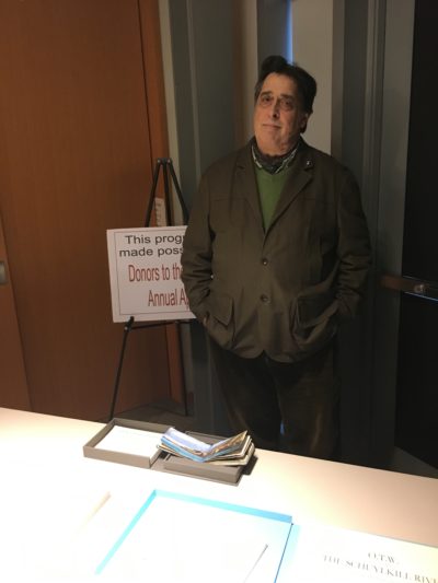
James Lancel McElhinney at Ridgefield Library, with his Hawaii journal

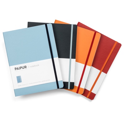
PAIPUR  Notebooks

Here’s a notebook with a layout I haven’t seen before: dot grid on one side and ruled on the other.

They make a few different versions, each of which comes in various colors.
Wide spaced with 100 GSM paper
Narrow spaced with 100 GSM paper
Fountain pen edition with 120 GSM paper (available with blank, wide or narrow spaced pages)

Read more: PAIPUR’s Successful Bullet Journal Release Proves Tactile Function Still Has Its Place in the Technology Era

Star Wars Costume Designer’s Sketchbooks

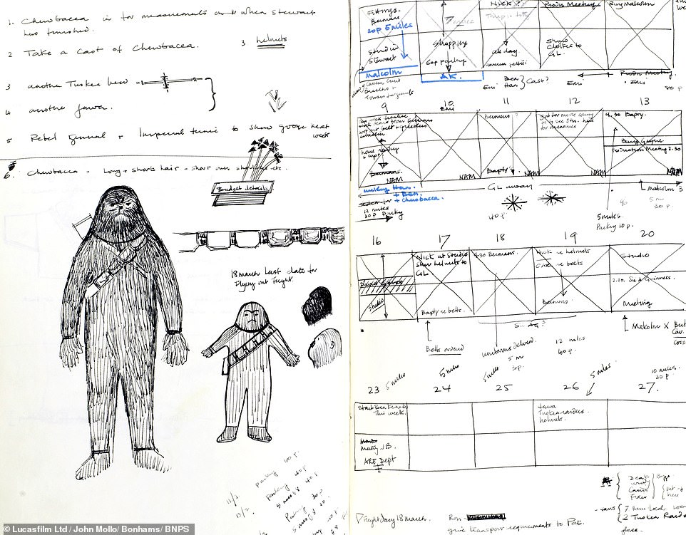
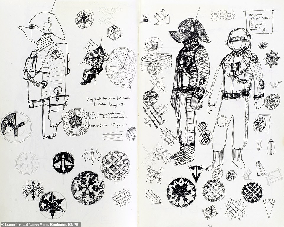
This one’s for Star Wars fans: sketchbooks from the 1970s belonging to the costumer designer for the original movie.

A treasure trove of items owned by Star Wars costume designer John Mollo are being sold at London auctioneers Bonhams including notes and his sketchbook.

If you don’t have the estimated £300,000 it will take to buy this, there’s always the Star Wars Moleskines...

See more: Sketchbooks belonging Star Wars costume designer to go under the hammer for £300,000 | Daily Mail Online

Review: Nolty Gold 2019 Diary/Planner

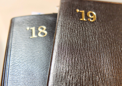
As regular readers know, I am a big fan of the Nolty Diary. Also known as the “Efficiency Notebook,” this Japanese planner has deservedly become a cult favorite, with Instagram posts galore showing off how people use their Nolty diaries. After very happily using a Nolty diary all through 2018, I decided to spring for an upgrade for 2019: the leather covered Nolty Gold. I also bought a couple other 2019 diaries that I’ll show you below.

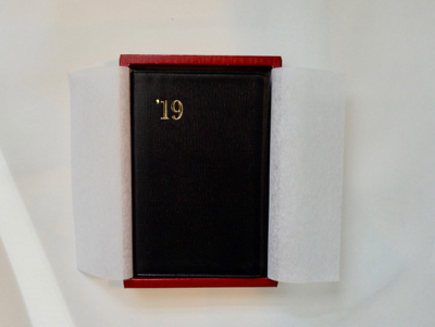
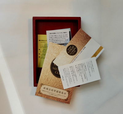
The Nolty Gold is a bit of a splurge, at about $56, but it feels special from the minute you see the box. The packaging is very elegant, with the notebook tucked in neatly under tissue paper. Underneath the notebook are various bits of Nolty literature, which I am unable to translate as I don’t speak Japanese. There are also 2 supplemental notebooks in the box– more on those a bit later.
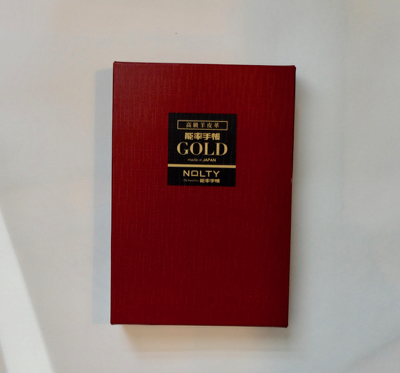

nolty gold 2019 - 1nolty gold 2019 - 2nolty gold 2019 - 3nolty gold 2019 - 4nolty gold 2019 - 5

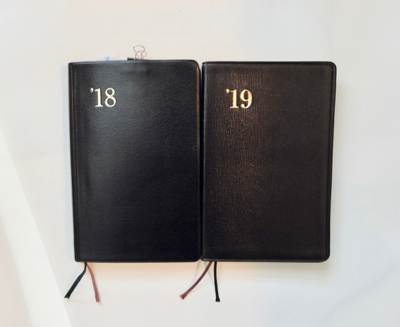
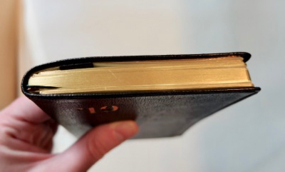
The diary itself gives an impression of luxury– you can smell the real leather, and immediately see the difference in texture from the regular vinyl-covered Nolty. But I did get a surprise when I first touched it– I expected it to feel very smooth and supple, and it sort of is– but the leather felt like it had little stubbly hairs sticking out of it! It felt a little rough and catchy against my skin, the way it feels if you handle silk fabric when your hands are dry and chapped. I thought maybe my hands WERE dry and chapped and that that was what I was feeling, but I could actually see the tiny bristles (or whatever they are) on the notebook. Luckily, these started to wear away as I handled the notebook and are now almost gone, leaving the leather feeling much smoother. It is soft but the texture seems more forgiving of scratches than some leathers. The year is gold stamped on the front and blind stamped on the spine, and there is a decorative line pressed along the edges. The folded-over leather gives a nice weight to the corners when you compare them to the vinyl Nolty.
nolty gold 2019 - 6nolty gold 2019 - 9nolty gold 2019 - 10nolty gold 2019 - 20

The overall size is just slightly smaller than the vinyl Nolty, due to less cover overhang, though it is still a bit more than I’d like. I’m hoping that with use the corners and edges will curl inwards a little, which hasn’t really happened with my vinyl 2018 diary. I was also surprised to see that the overhang was not symmetrical all around on the Nolty Gold I bought. Every other Nolty diary I’ve seen is so impeccably crafted with perfectionist attention to detail, and this notebook has no other flaw that I could detect. That said, the variance I noticed is not extreme and probably wouldn’t bother most people.

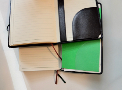
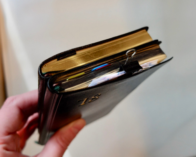
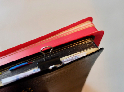
The overhang is slightly bigger on the back cover and the bottom edge. At least on the back cover, I thought this might be to allow room for the supplemental booklets that can be tucked in the back. Every Nolty comes with a removable address book that slips under a strap and behind the back pocket. In addition, the Gold model comes with two booklets containing just lined paper for additional notes. They are made slightly narrower than the address book so they fit perfectly  without distorting the notebook cover, and their gilded edges match the main diary. I wish Nolty put a strap and pocket inside the front cover so you could add the 2nd supplemental notebook there. I’m not sure yet what I’ll use mine for, but I like the way they fatten the notebook up a little, and they should be handy for lists and other notes.
nolty gold 2019 - 11

nolty gold 2019 - 19

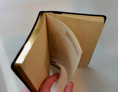
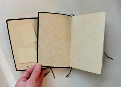
Inside the Nolty Gold, the only real difference is that the endpapers have a sort of mottled tone to them. It goes nicely with the gilded page edges. Otherwise, the page layouts are the same, and you still get the 2 ribbon markers. The back pocket and strap are made of black leather to match the exterior, vs the clear plastic on the basic Nolty.
nolty gold 2019 - 7nolty gold 2019 - 8

You can see my 2018 Nolty review for other details on the paper performance, etc. I really love my 2018 Nolty, and I love the leather 2019 Nolty Gold even more. I bought mine on Rakuten and paid ¥6160 ($56.41) including shipping from Japan, so this diary is quite an investment, but I think it will be hard to go back to the regular version!

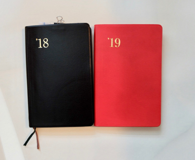
I also bought two other 2019 Nolty diaries.  Model 1218 is a red version of the standard Efficiency Notebook. The cover and page edges are a nice bright red, but otherwise it is exactly the same as model 1211. The red is fun, but I prefer black so I’m giving this to someone as a gift. (I paid $16.99 for it at Kinokuniya’s website, with free shipping since I had it sent to their NYC store for pickup.)
nolty gold 2019 - 15nolty gold 2019 - 18

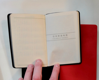
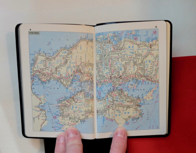
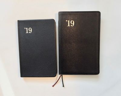
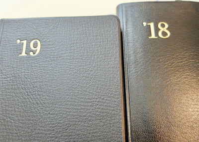
Model 1121 is the smaller version of the Efficiency Notebook, with extra train maps. Did I have any need for Japanese train maps that I can’t make head nor tail of? No, but they sure are fun to look at anyway! And I LOVE this little diary! The size is adorable. It fits nicely into a passport size Midori Travelers Notebook. The cover is a different texture from my 2018 model 1211. I like the 1121’s more pebbly texture.
nolty gold 2019 - 12nolty gold 2019 - 13nolty gold 2019 - 16nolty gold 2019 - 17

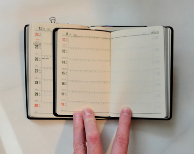
The interior layouts have been shrunk down proportionally, even the lined pages which are spaced at 4mm instead of 5mm. If you don’t have small handwriting, this notebook may not be for you!
nolty gold 2019 - 14

I’ve gotten so accustomed to using 3.5 x 5.5″ notebooks that I rarely even consider any other size for daily use, but for some reason, I just adore this little Nolty and will be using it for something– maybe some tiny daily doodling. (I paid $21.99 for this via Kinokuniya. Next time I won’t bother getting the extra train maps, as the version without them was only $17.99. I don’t know why it’s more expensive than the larger version.)

I haven’t done any pen tests on these but I am sure they have the same paper found in my 2018 diary– it is wonderfully smooth and fountain pen friendly. Everything about the Nolty diary is just so pleasing to all the senses– tactile, visual, and olfactory, anyway! I am really looking forward to another year of using a Nolty as my planner/diary/life log/to-do list keeper and can’t recommend this brand enough! These are hard to find in stores, so if you want to buy a Nolty diary and can’t make it to Japan, I suggest you try Rakuten or Kinokuniya.

Wyoming Artists’ Sketchbooks

Unfortunately this exhibition of artists’ sketchbooks is long over, but it ran earlier this year at the Western Wyoming Community College Art Gallery in Rock Springs. It looks like it was a lovely display!

The pages below are by Leah Hardy:

Below are sketches by Florence Alfano McEwin, who was also the curator of the exhibit:

“Drawn Thought,” the title of a teaching art exhibit now on display in Rock Springs, is something of a misnomer. Many — maybe half — of the sketchbooks exhibited contain little to no drawing. In others, drawing might be only one component of the sketchbook. These books present an intimate spill of whatever catches the artist’s mind at that moment: a scribble line drawing of a horse, a ticket to a museum, a phone number, the landscape observed and remembered.

Read more: Drawn Thought: Artist Sketchbooks | WyoFile

Notebooks, journals, sketchbooks, diaries: in search of the perfect page…