What a lovely display of notebooks and pencils, from the Instagram account of xanelachic. I recognize a couple of brands from Portugal, similar to ones in my own collection: Serrote Letterpress (the white one that says “caderno”) and Emilio Braga (the hardcover with contrasting spine and corners at bottom left).
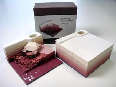
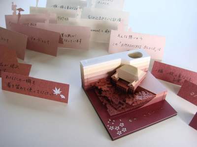
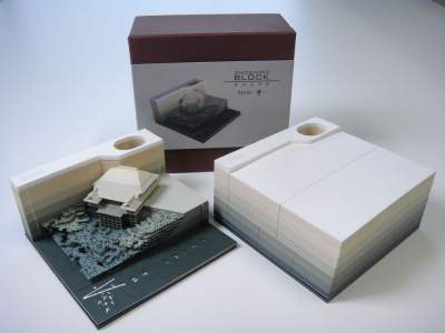
This is not exactly a notebook, but it’s quite an extraordinary paper product! The Omoshiro Block is a notepad with laser cut pages. As you tear off each page, an amazingly detailed 3D sculpture is revealed! Mind blowing…
Omoshiro Block – a Notepad with detachable pages, which as turns into a miniature work of art: paper sculpture in the form of a Buddhist temple, violins, trains, piano or camera. The Japanese company Triad, specializing in the production of architectural models, produces a notebook from tearing each page reveals the details hidden works of art – a miniature copy of the temple kiyomizudera in Kyoto, Asakusa Shrine in Tokyo or the TV tower. In Notepad more than 100 different sheets of paper.
The website even has a whole category for Journal Keeping, among other aspects of the creative process. And on this page, you can see more about Ritchie’s sketchbooks, which since 1992 his wife hand-binds for him. He has filled 146 sketchbooks so far.
LG:  How did your journals evolve and what makes them so important to you? CR:   I left undergraduate school in 1977 and realized that having a small sketchbook in my pocket to record thoughts and images was an immediate grounding in a world of distractions. Working with pen and ink on paper in a palm-sized book had an immediacy and a feel that appealed to me. The content in the books has evolved over the years. Originally, there was a lot of open page with phrases and line drawings, mostly my attempts to track my thinking and seeing in the everyday world. Eventually, I started dating entries and began writing longer, more involved entries and also integrating images in black watercolor and brush. Dreams eventually presented themselves as an interesting way to push deeper toward my subconscious. When my wife and I moved into our home in 1984, I started working out of the same window and began to record the subjects I continue to work with. Eventually, the primary colors and then secondaries entered the mix and the journals became even more packed with images and writing. What I like best about my collection of journals is that I can look back over the chronology of my life and pick up recurring threads within the images and writings. The journals are the spine of my project. It’s very rewarding to look at my shelf of 144 books (and counting) and know that I can stride the years and see a picture of who I was at so many moments. I also appreciate what my dealer John Lee of BravinLee programs says about my books; they are stay-at-home travelogues. I do see myself as trying to see how far I can go in a single place.
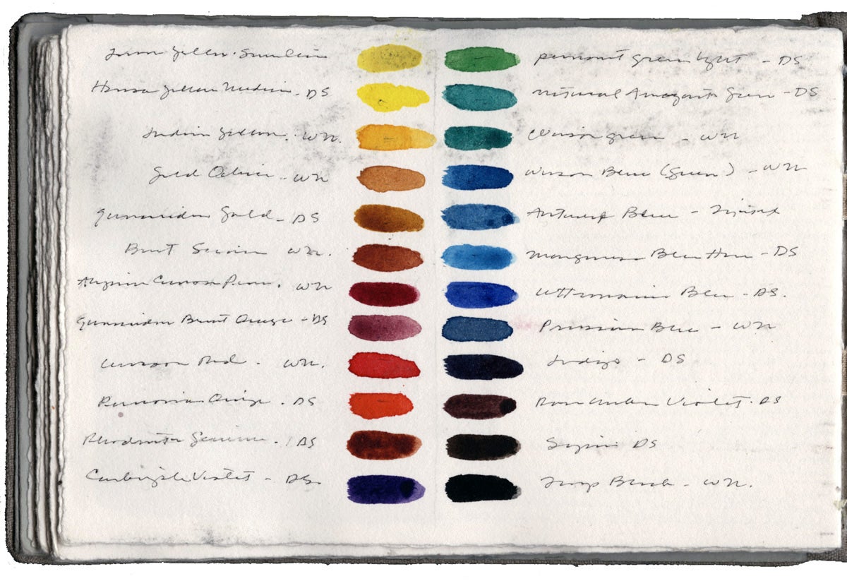
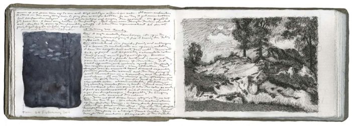
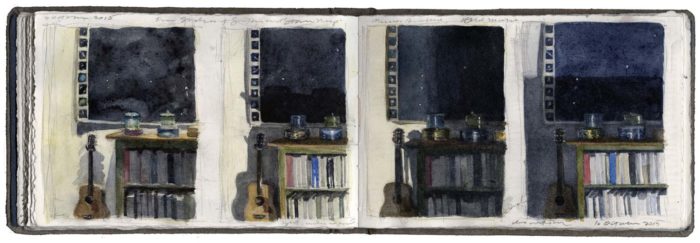
Two Studies, One After an Oil Painting by Camille Corot, Book 135, 4 x 6″ pen and ink, graphite, and watercolor on Arches paper in bound volume, open book size: 4 x 12″ 2011Four Studies of a Guitar and Star Map, Journal Entry, Book 143, 4 x 6″ watercolor, graphite, and pen and ink on Arches paper in bound volume, March 2, 2016
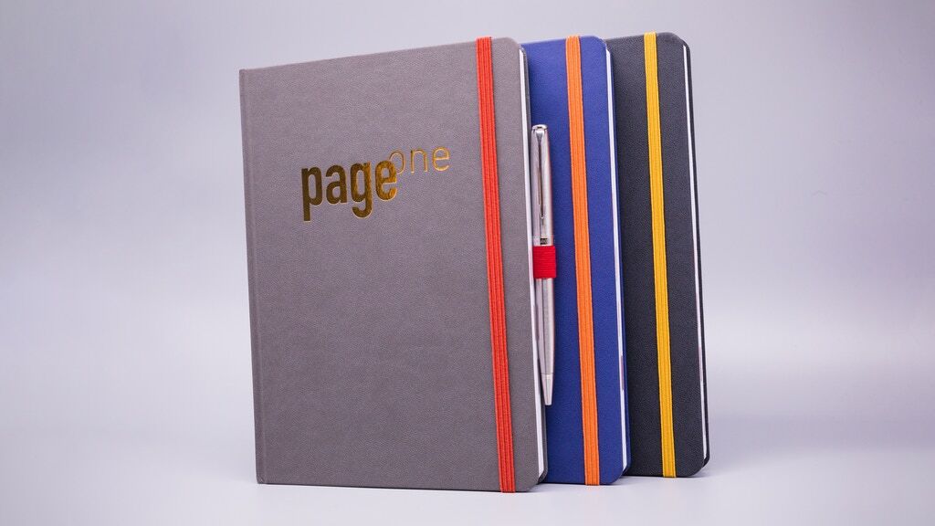
Here’s a notebook Kickstarter campaign that may be of interest to writers: Page One, a notebook with sections structured for all the different aspects of the writing and publishing process, such as “Characters,” “Plot,” “Research,” and “Submissions.” The campaign ends on May 2, 2019.
This week’s addict is Alan Rusbridger, the former editor-in-chief of The Guardian. I’d read an article about him that mentioned he’d used over 200 Moleskines so far, so these must be just a few of them, featured on his Instagram account:
This work is a facsimile of an artist’s sketchbook, neatly bound within a facsimile of a marble blue composition book, its pages open to a series of small abstract pattern paintings. There is something deeply satisfying about the way the tactile object is reproduced – including, for example, on each left hand side of the page, the faded imprint of another image. Included is a supplementary essay by James Yood.
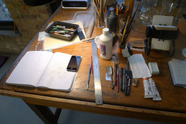
Another random magazine photo from a few years ago. My eyes went straight to the pile of notebooks!
Oddly enough, the other thing that caught my eye is the stack of books under the notebooks– I’m almost positive it is multiple copies of When a Crocodile Eats the Sun, an amazing book that I highly recommend! I guess Joanna Coles loved it as much as I did…
As I’ve mentioned several times on this site, the Bindewerk Linen Notebook (officially known as the Bindewerk Linen Flexible Cover Travel Notebook) is one of my most exciting finds for alternatives to Moleskine notebooks in the 9×14 cm hardcover format. I have bought 10 of these so far because I love them so much. I’ve used one so far as a daily notebook, and I’ll be starting another one any day now. But now that I’ve seen quite a few examples of these Bindewerk notebooks, I do have some frustrations with them.
The first Bindewerk Linen notebook I bought was from the museum shop at the Frick in NYC. They had a few on the shelf, and I examined them all closely and selected one that was pretty close to perfect in terms of symmetry and a nice spine. The others in the shop were ok, but not quite as good as the one I bought. My next few purchases came from online sellers (OrangeArt in the US, and Papersmiths in the UK) and , so I was a bit disappointed when I saw that some of them had uneven spines and cover overhang that was larger on one side or the other.
Note tight rounded spine on blue notebook, vs. uneven loose spine on light green notebook.
The other day I was in Paper Presentation on 18th St in NYC– always one of my favorite places to shop for notebooks. They now have quite a good selection of these Bindewerk notebooks in lined, dot grid and plain pages, in all their pretty colors. I picked through the ones with plain and dotted pages and quite a few of them had the crooked/loose spine and uneven overhang issue. I ended up finding one pretty good one, and bought it, but I found the consistency of the problems to be quite disturbing. And even the “good one” I bought seemed to have some extra glue on one side of the spine. There are also a couple of pages inside where the glue between signatures extends a bit too far in and the pages don’t open as flat as they should. Otherwise the notebook opens flat and functions just fine, but these minor defects do bother me.
Bindewerk notebook from Paper Presentation, with uneven spine and extra glue.
These notebooks are expensive– at Paper Presentation, they are $18.95, which is the lowest price I’ve seen. My first one from the Frick cost $20. Either way, it is very high for a 9x14cm notebook. (In this size, Moleskine’s list price is $14.95, as is a Rhodia Webnotebook and a basic pocket Leuchtturm. A pocket size Baron Fig notebook is only $12. HandBook Artist Journals are now usually around $13-14. Bindewerk has some advantages over each of these, and to me, the combination of perfect size, beautiful cloth covers and the fantastic paper inside make them worth a little more, but it is also worth noting that they lack a ribbon marker, elastic closure, or back pocket, which are standard on most of the competition. The packaging says they are “handmade in Germany,” so I would expect to get a high level of quality vs. products that are more cheaply produced in China. I can’t expect any notebook maker to be 100% perfect all the time, but with so many binding issues, I’m not sure Bindewerk notebooks are really delivering the consistent level of quality this price point demands.
I can still see myself buying more Bindewerk notebooks if I can inspect them in person and avoid crooked bindings, but I definitely won’t be ordering them online. I hope they can work on their quality control and make sure all their notebooks live up to their potential.
This week’s addict is another Reddit user, who posted the image below of his tidy and consistent collection:
Notebooks. It’s not fancy, but each month I put it on the shelf and grab a new one. I used to have nice notebooks, but then I tried to standardize and reduce the barrier to drawing. I never want to think ‘I shouldn’t draw that, this paper is too nice.’