This week, we have a Traveler’s Notebook addict! What a lovely display…
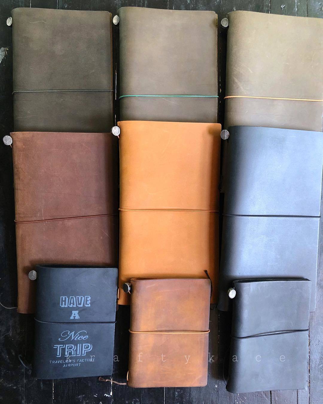
She says:
I can stare at them all day 😍
Me too!
See more at her Instagram: æŽ ç¾Žä» on Instagram: “I can stare at them all day 😍â€
This week, we have a Traveler’s Notebook addict! What a lovely display…

She says:
I can stare at them all day 😍
Me too!
See more at her Instagram: æŽ ç¾Žä» on Instagram: “I can stare at them all day 😍â€
As I noted in my recent “using now” post, I tend to carry around a sketchbook and a journal, two separate notebooks. (And this year, I’ve added a third standalone notebook, a Nolty diary for logging, planning and lists.) There are a few reasons for this– paper type is a major one. I enjoy writing on lighter paper such as what’s found in a Moleskine squared notebook, but for drawing, where I may also use watercolor paints, I want to use something with unlined heavier paper, such as a Moleskine sketchbook.
At the moment, I’ve been using the Bindewerk linen cover notebook as my journal– this paper would be fine for drawing and light watercolors, but the dot grid pages are not ideal for anything other than casual sketches. My journal pages contain a variety of writing, doodling, minor scrapbooking and the occasional rough drawing:
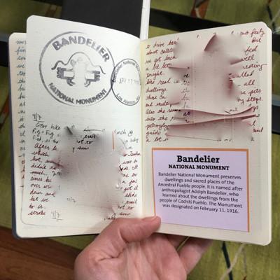
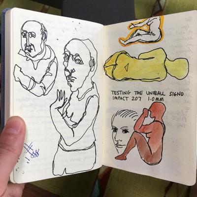
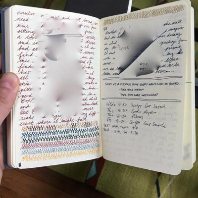
For more serious drawing, I just finished a Moleskine sketchbook and started using a Leda Art Supply pocket sketchbook for the first time. It’s a nice chunky size, and the paper is very good, even though it is thinner than Moleskine paper. The notebook has double the number of pages of a Moleskine sketchbook– this is a good thing in a way, but it also makes me feel like it will take too long to finish it! (Sometimes I just get antsy to unwrap a new notebook…)
Because the Leda paper works nicely with fountain pens, I’m tempted to combine my journaling and sketching in this one notebook. This would cut down the number of notebooks I’m carrying around in my bag every day, and I like the idea of my journal entries being interspersed with colorful drawings and paintings. But the biggest problem with that idea is that my friends and family often ask to see what I’ve been sketching. I usually just hand them the sketchbook so they can flip through at their own pace. But there’s no way I want to hand someone a notebook that contains all my journal entries! (The stuff that is blurred out in the photos above.)
I’ve had a similar worry about taking notes in meetings at my job– I usually had a dedicated work notebook on my desk in my office, but it was a large notebook and I didn’t always carry it with me on business travel. So sometimes I’d take out my journal to make notes in a meeting, and I’d always worry that I’d inadvertently reveal a personal page to someone sitting next to me. I’d also be paranoid about leaving the notebook at my seat if I got up between sessions– it is unlikely that some nosy person would just start flipping through it but what if they did?
All this leaves me feeling like it works best to continue to maintain multiple notebooks to separate public things I might want to share, and writings I’d rather keep private. How do you handle this dilemma? Do you let other people look at some, all, or none of your notebooks?
From Walter Benjamin: 100 Notes, 100 Thoughts:
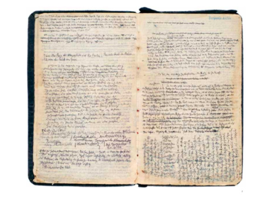
In 1927, on the occasion of a several-months-long visit to Paris, Walter Benjamin began taking notes on the Parisian Arcades for his most ambitious book project…. With her introduction to a selection of these handwritten notes, Nikola Doll describes how the author attempted “to integrate the principle of the montage as an epistemological technique.†Color charts, schemata, and diagrams act as guiding principles to navigate the thicket of excerpts and quotations. Benjamin’s personal color-coding shows an attempt to make order within the vast constellation of his own notes—a tension between an impulse toward structure and the potential of the open field of his interests.
Read more at: Walter Benjamin | Contemporary Art | Hatje Cantz
From the New York Times last week, some glimpses of the sketchbook of Minh Uong, a visual editor for the business section:
Minh Uong, a visual editor at The Times, uses both low- and high-tech tools to create editorial art, but tech does not necessarily make it easier to become a professional illustrator.
Can you explain your creative process for making and planning illustrations for The Times?
Being the visual editor for the business section, I’m responsible for providing artwork that illuminates stories that are hard to photograph. It’s a challenging task at times, since our section features articles with topics that are difficult to visualize. Try to think of images that relate to private equity, net neutrality or the trade deficit.
Recently, I had to art a story about fake Mark Zuckerberg and Sheryl Sandberg accounts on Facebook and Instagram that scam people out of their money.
I doodled my first thought in my sketchbook using a black Paper Mate pen showing people stealing and running away with images of Mark and Sheryl. Then I sketched a different concept showing a group of scammers hiding behind Mark and Sheryl masks.
Read more at: How Technology Is Changing Visual Art – The New York Times
This week’s addict posted the photo below on Instagram and says:
I have a problem… a notebook problem. Just unpacked a box that among other things included 20 notebooks… I have 3 more boxes like this…
 Source: JQ Smith (@jacoq) • Instagram photos and videos
I love that Tintin notebook– I’ve been obsessed with Tintin ever since I was a kid but for some reason have never bought a Tintin notebook… not sure why I haven’t really seen any, but there are a few available on Amazon.
Is there anyone who can resist a composition book? I can’t, even though in some ways they really don’t fit into my notebook usage patterns these days. They aren’t my favorite size, they aren’t my favorite shape, and it’s sometimes hard to find ones that aren’t wide-rule lined, but I love them anyway. I admire the way other people use them, such as Michael Bierut:

(Michael Bierut’s 26 Years, 85 Notebooks)
and Lynda Barry:
Occasionally I’m tempted by the big stacks of cheapo composition books in crazy colors and designs that Staples promotes for back to school, but I know I won’t use them, so I manage to resist. However, for research purposes at least, I allowed myself to purchase two composition books recently. If you search “composition book” on Amazon, the results are a dizzying array of styles and brands. But I focused on two particular models, both by Roaring Spring:
The unlined basic Composition Notebook (also available in graph, lined, and some other variations)
The unlined Premium Composition Notebook (also available in a graph ruled version and lined)
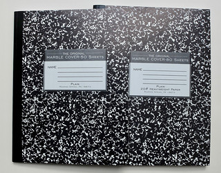
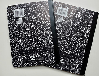
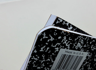
Both are made in the USA and have the classic composition book design with a black and white patterned cover, single stitched signature and taped spine. Both have a class schedule grid printed on the inside front cover (though designed a little differently). Both have bright cool white paper. But here are the differences:
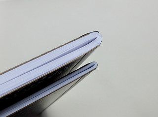
The Premium model is 10.25 x 7.875″ and 80 pages. It has squared corners. The paper is said to be “heavyweight,” and specified as 20#. The inside back cover is blank.
The regular model is 9.75 x 7.5″ and 50 pages, with rounded corners. No paper weight is specified on the notebook itself, but the description on Amazon says it is 15#. The inside back cover has conversion, multiplication and measurement tables.
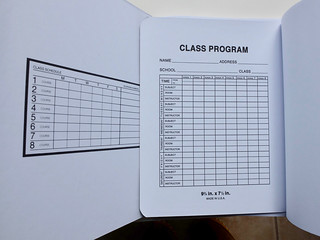
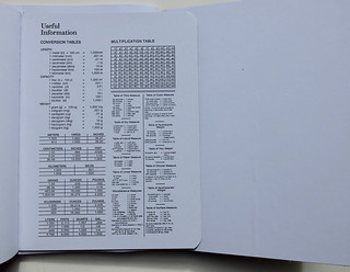
And here’s how the different papers perform (with the premium heavyweight paper on the right in the photos below, in case it’s not obvious!):
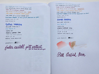
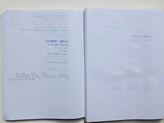
Pretty striking, isn’t it? The heavyweight paper in the premium version only bleeds in a few spots with fountain pens, and generally has less bleed-through and show-through. It’s still not artist-grade paper by any means, but it can even handle a little light watercolor. The regular paper is pretty flimsy, with a lot of bleed.
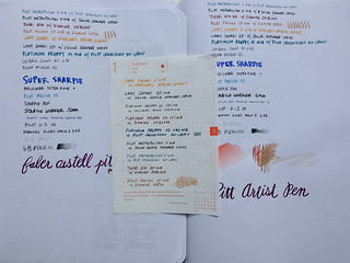
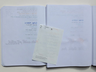
The Premium Roaring Brook composition book really delivers a lot more value if you can catch it at a good price– I’ve sometimes seen it as high as $13 but often it is within a dollar or two of the regular version, around $6 or so, depending on the page format. Just make sure you are shopping carefully online so you get the correct version! Here are links with current pricing at Amazon:
Premium graph ruled:
Premium college ruled:
Premium plain/unlined:
Here are links for the regular version if you prefer the smaller, rounded-corner format:
Regular graph ruled:
Regular wide ruled with margin:
Regular plain/unlined:
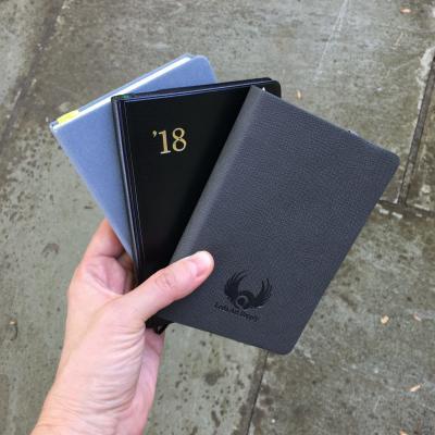
This is an unusual update for me– for the first time since starting this blog, I think, I am not using any Moleskine notebook in my daily carry. I just finished a Moleskine Sketchbook, and decided to replace it with a Leda Sketchbook (I will soon be doing a full review). I like the Leda Sketchbook, and it’s fun to try something a little different for a change, but I don’t think it will be making me want to get rid of my stash of 50+ spare Moleskine Sketchbooks!
I continue to use my 2018 Nolty diary as a logbook and planner, and my Bindewerk Dot-Grid Linen Cover notebook as my journal. I’m almost done with the Bindewerk journal, and I think when I’m finished, I will either start using the Leda sketchbook for journal entries as well as drawing, or I’ll go back to using a squared Moleskine for journaling. We’ll see, but my no-Moleskine phase may not last all that long!
The other change from my last “using now” post is that the Midori Traveler’s Notebook is not currently active. I was using it as my wallet for a couple of weeks, but then when I took off on a long road trip, I decided to leave it behind– I didn’t want to lose it or ruin it, and it was also heavier and bulkier than my other wallet. When I got back from the trip a couple of weeks ago, I didn’t switch back to the TN, but I’m thinking about giving it another try. I don’t want to spend money on buying any more travelers notebooks, but I’m slightly tempted to try a non-Midori one in a slightly larger size that would hold my Nolty diary. I do like the idea of a notebook/wallet combination, but the passport size TN doesn’t allow me to use the notebooks I want.
How about you, readers? What notebooks are you using lately?
This is a new one: a notebook that claims to “cure your sketchbook phobia forever” because you have to rip open the sealed-shut cover to use it!

The idea is that a perfect, pristine new notebook is sometimes too intimidating to use. The RIP notebook is dipped in a paint that seals it shut, and you have to pull a string to rip through the coating and open the notebook, thereby instantly breaking it in and giving it a touch of imperfection and wear. It must also feel a bit like uncorking a bottle of champagne!
Read more at : this little notebook by eric primo may cure your sketchbook phobia forever
I found this week’s addict on Instagram, where describes herself as “Stationary Hoarder / Diarist / Journal Keeper / Urban Sketcher / Paint Lover / Lover of all things Crafty” and shared this image of her collection of journals:
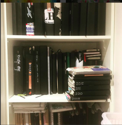
On Instagram, she shares lots of beautiful images from inside her journals, and notes that some of her large journals are meant to be used for restaurant table bookings… a new type of notebook that I’d never really thought about– interesting!
An intriguing art installation, which happens to include some notebooks:
Nick Flessa lays bare the possessions of his mother for the world to see, as they become both an index of her life story and her son’s grief.
Read more at: An Artist Carefully Catalogues His Late Mother’s Possessions